
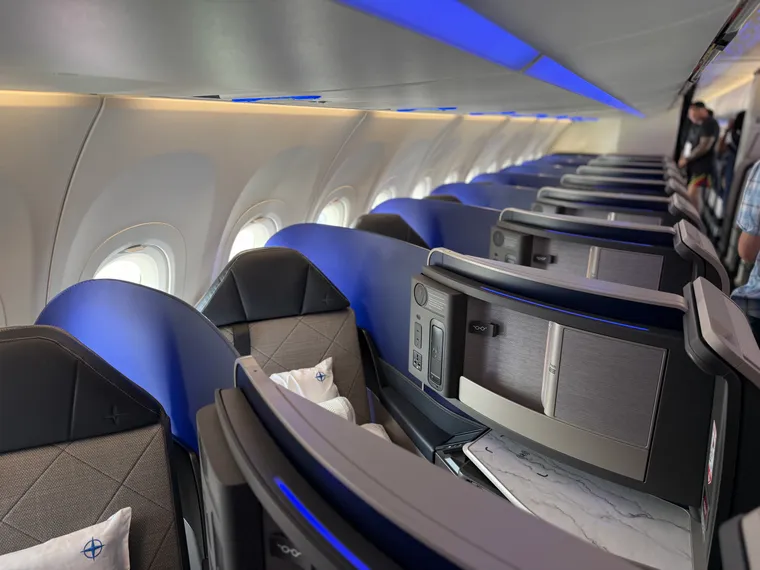
At a very quiet Farnborough Airshow, United’s newest narrowbody stood out. Its Airbus A321XLR introduces the airline’s new single-aisle standard, and for Polaris it’s launching an aisle-facing herringbone: Altitude, from Elevate. This seat will be on United’s premium domestic A321neo non-XLR Coastliner fleet — as well as, The Up Front understands, the 737-10s that United has on order, though in a slightly less angled version for the 737’s narrower fuselage.
So what’s the Altitude seat like, and how does it stack up? It’s complicated, especially if you start taking into account several factors that weren’t and aren’t entirely in United’s control.
The Up Front understands that development of this cabin and this seat began in the late 2010s, with 2018 the most commonly mentioned date in our discussions about the programme itself. It was, therefore, delayed by various factors including the pandemic, certification issues, and industry supply chain problems.
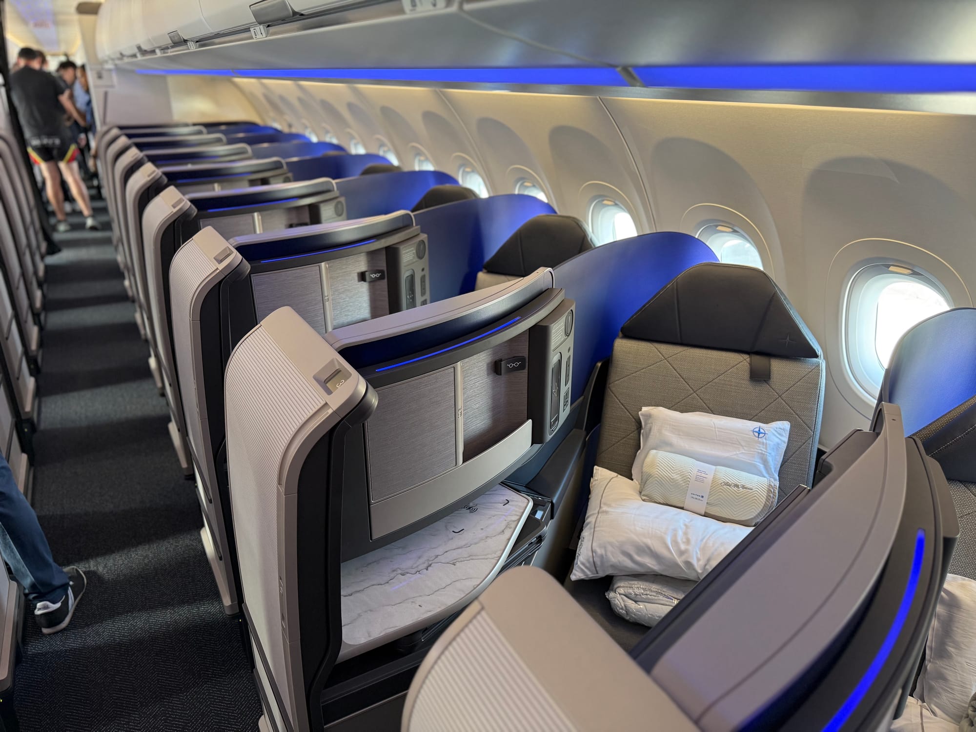
This creates a genuine tension in comparison, since so much of the interior feels rather 2018 in its functionality and styling. That is, of course, understandable given what readers of The Up Front know, from an industry perspective. There is also a lot of impressive engineering in this 32-inch-pitched, 49-degree-angled herringbone.
But passenger expectations in aesthetics and functionality do not — and arguably should not have to — take these details into account.
Let’s get on the aircraft.
Entryways and galleys offer the only “third space” on the aircraft, but don’t feel premium
Entry to the aircraft is, remarkably for a modern premium narrowbody, very unimpressive: it’s just bits of industrial galley equipment sticking out, with a grey panel opposite the door with the United logo partially visible on it.
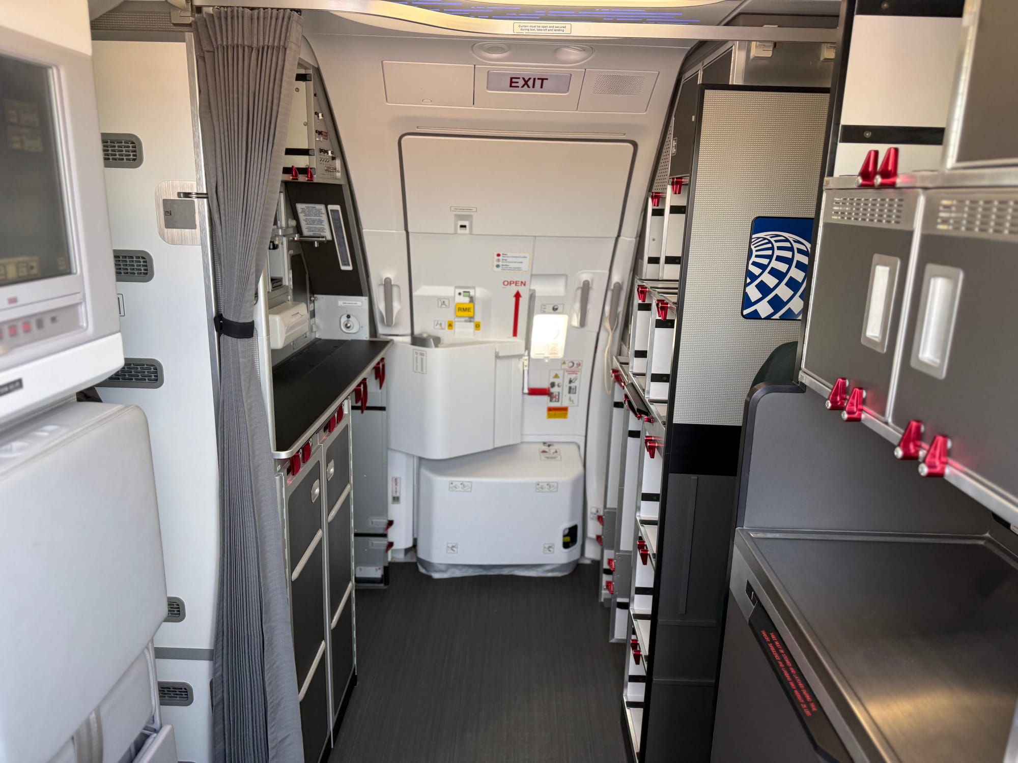
The Up Front understands that this is an EnCore monument from the Boeing-affiliated interiors stable, and its dated appearance may well stem from the delays with the rest of the aircraft, compared with other recent releases.
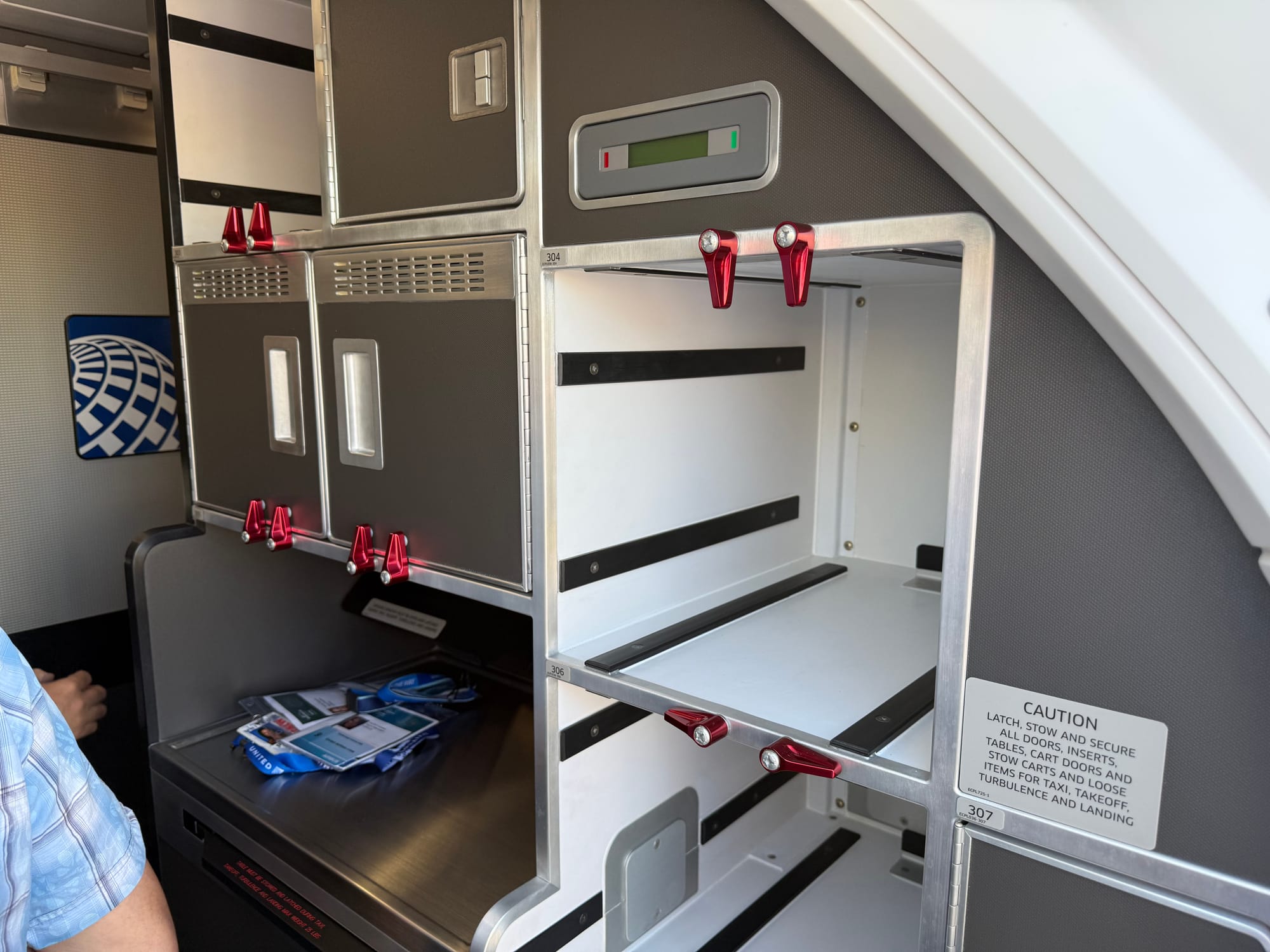
Frankly, this feels little improved on the flydubai 737 MAX 8 forward galley I flew in 2018, which I often give as an example of how early premium/longhaul narrowbodies missed the mark.
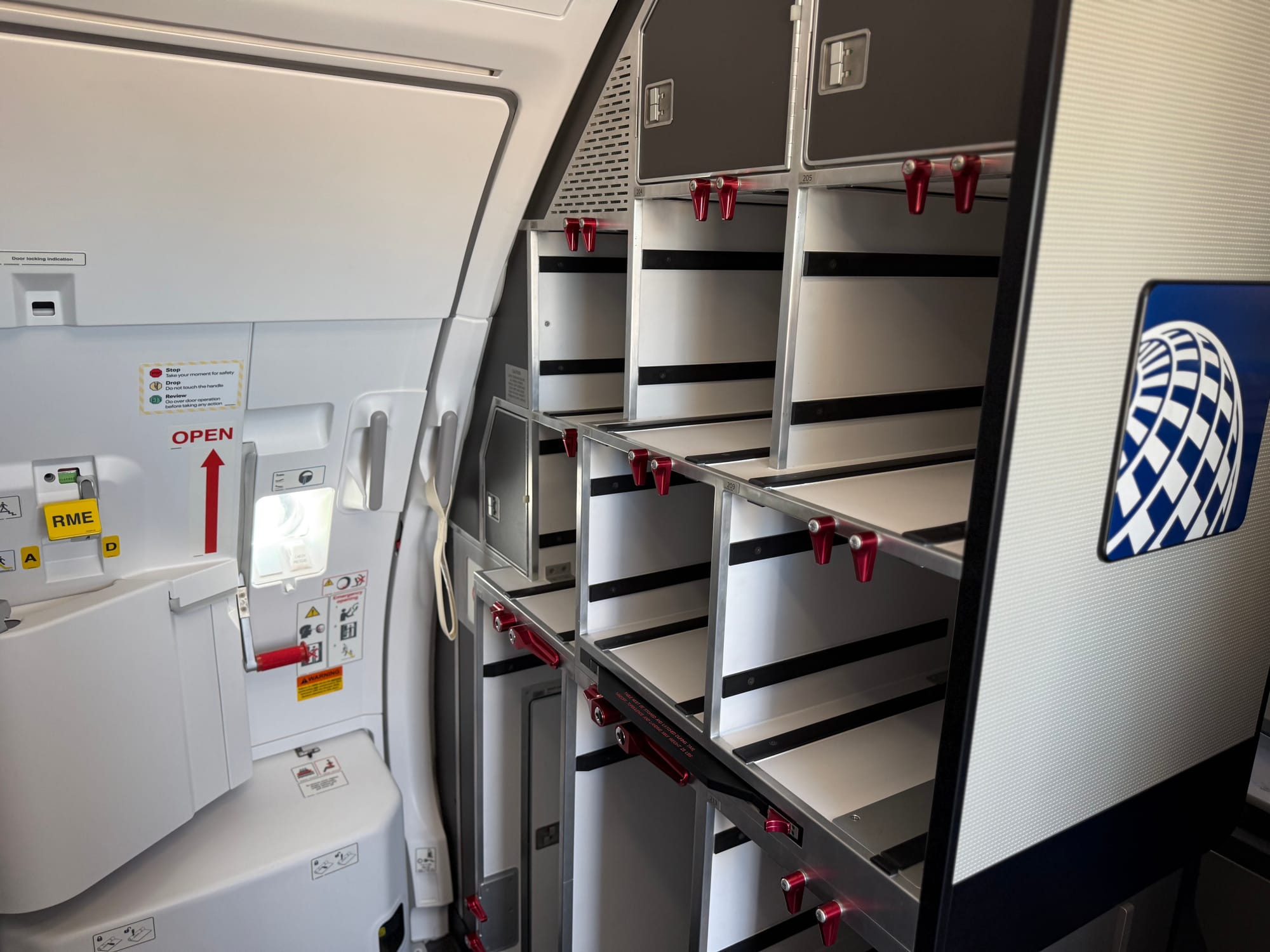
Here, too, it feels like a missed trick for United and its suppliers: an entryway that does not feel like walking into a hotel through the industrial kitchen is no longer unusual or impossible.
Of note for those of us keeping an eye on airlines customising — or not — the overhead U-shaped feature light at the front galley, and the ceiling LEDs throughout the cabin, United’s features a series of dots and dashes overhead.
Like much of the aircraft, it’s fine, I guess, but hardly inspiring. It could be any blue-shaded airline, and United has the ex-Continental globe pattern it could have used here instead.
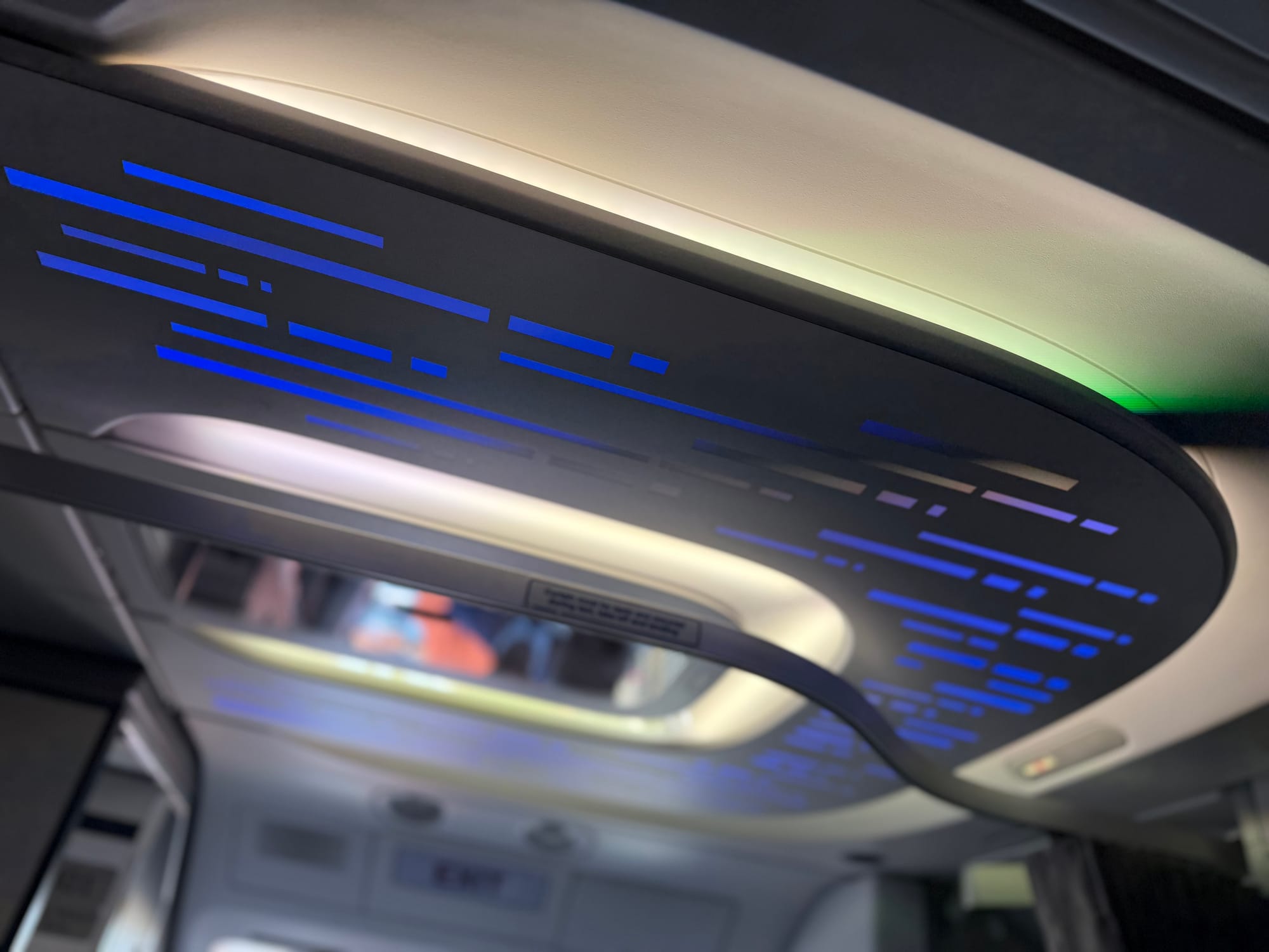
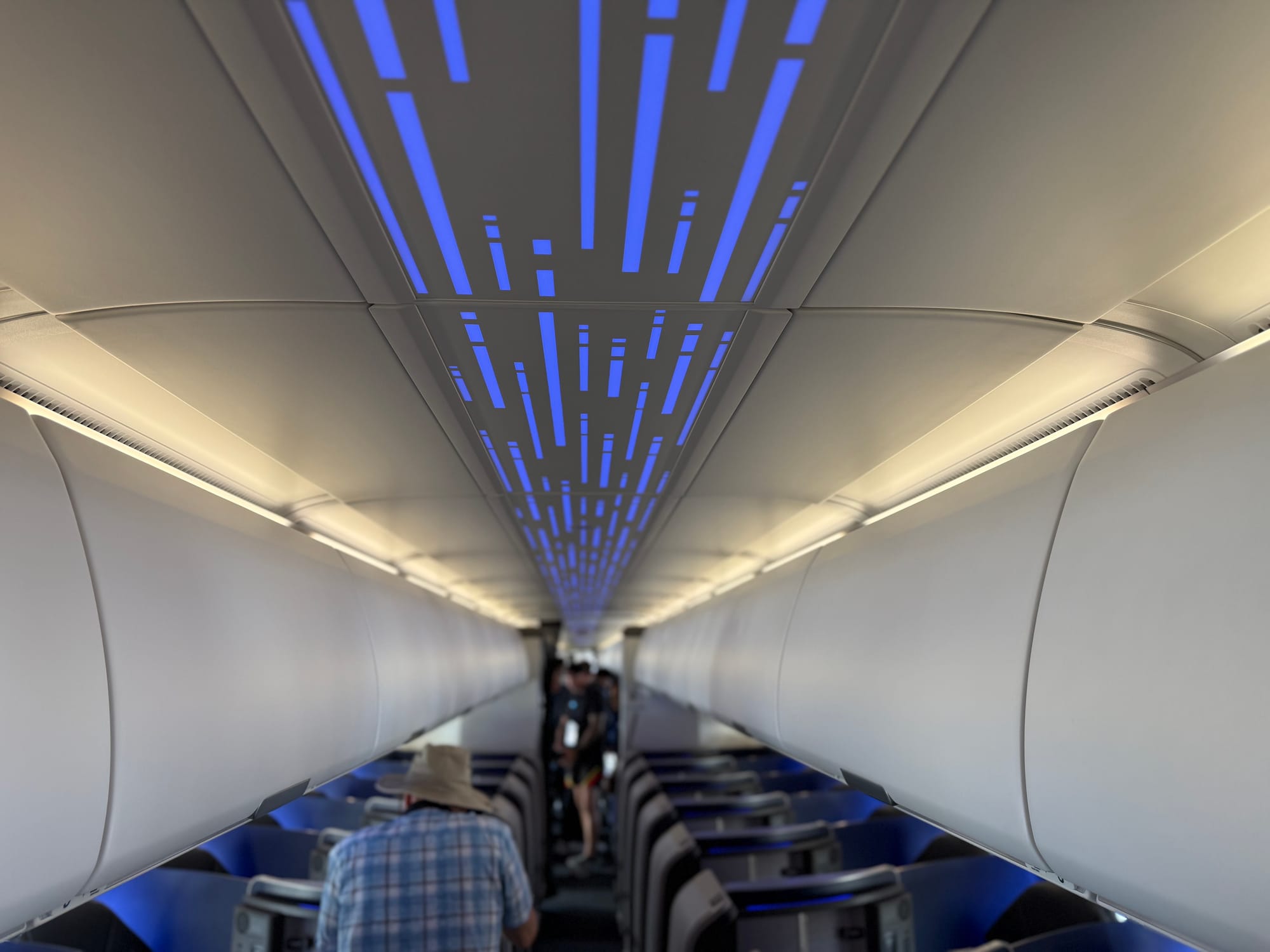
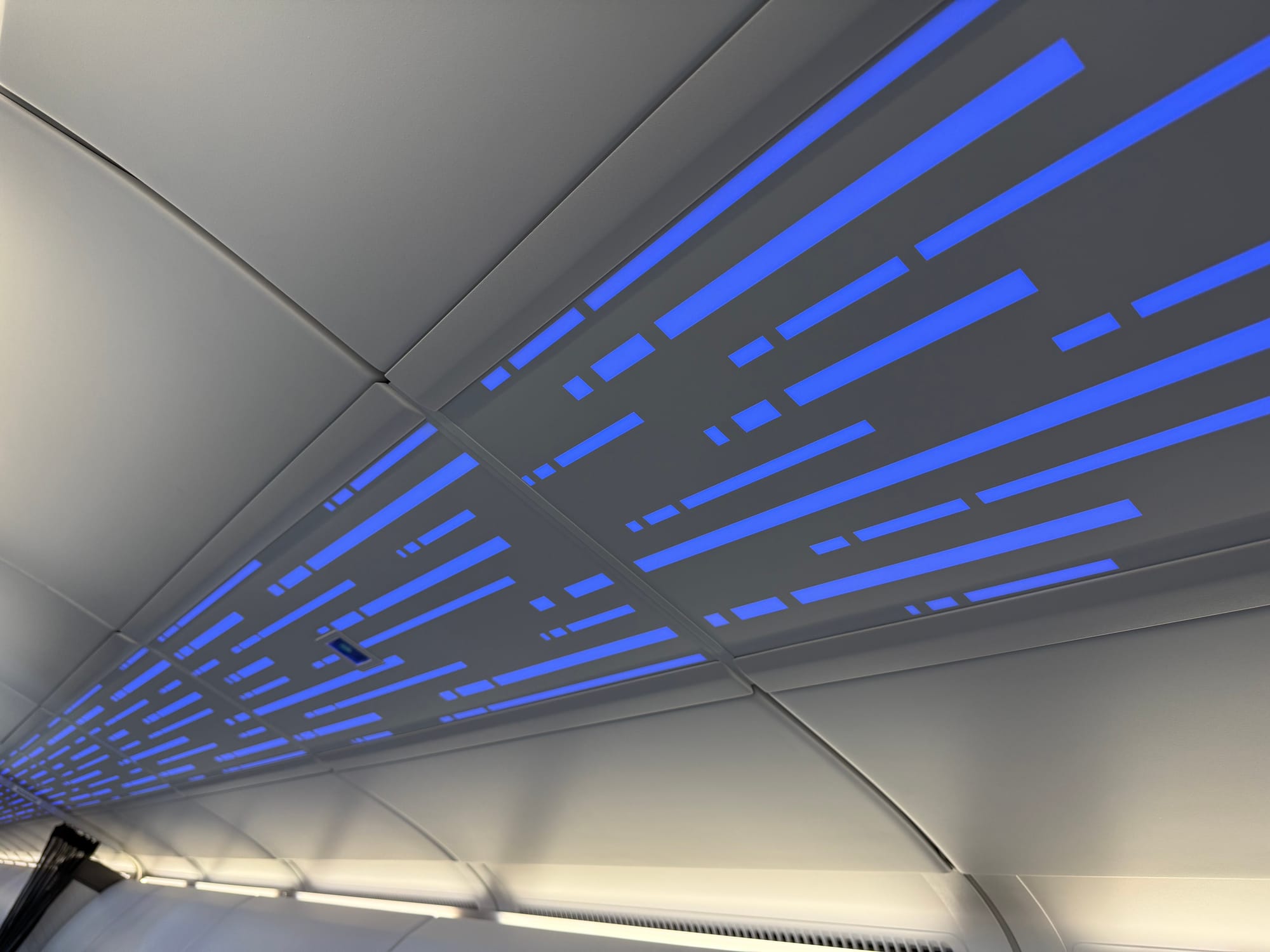
This dots-and-dashes motif doesn’t say “United” in any way. Image: John Walton
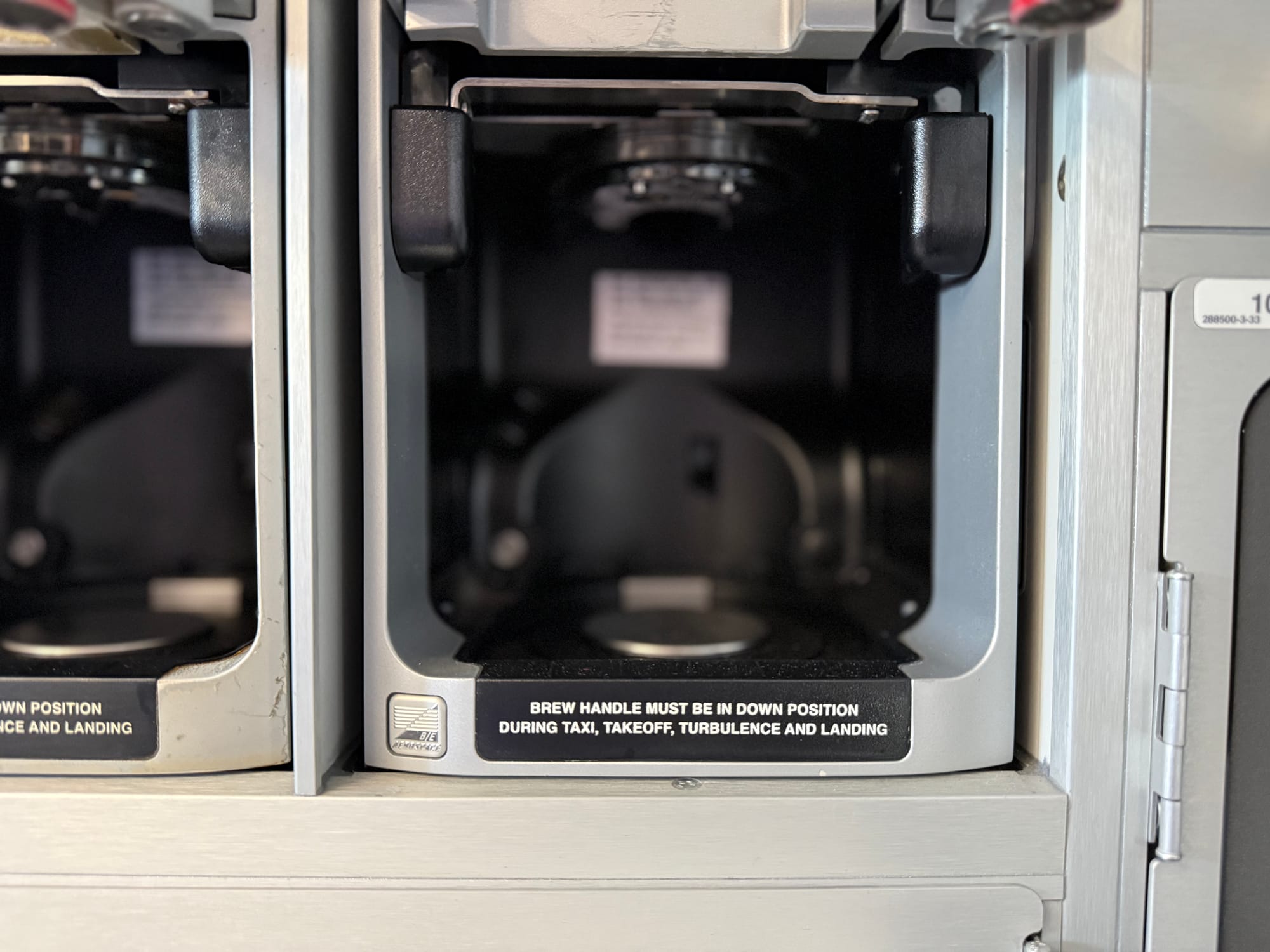
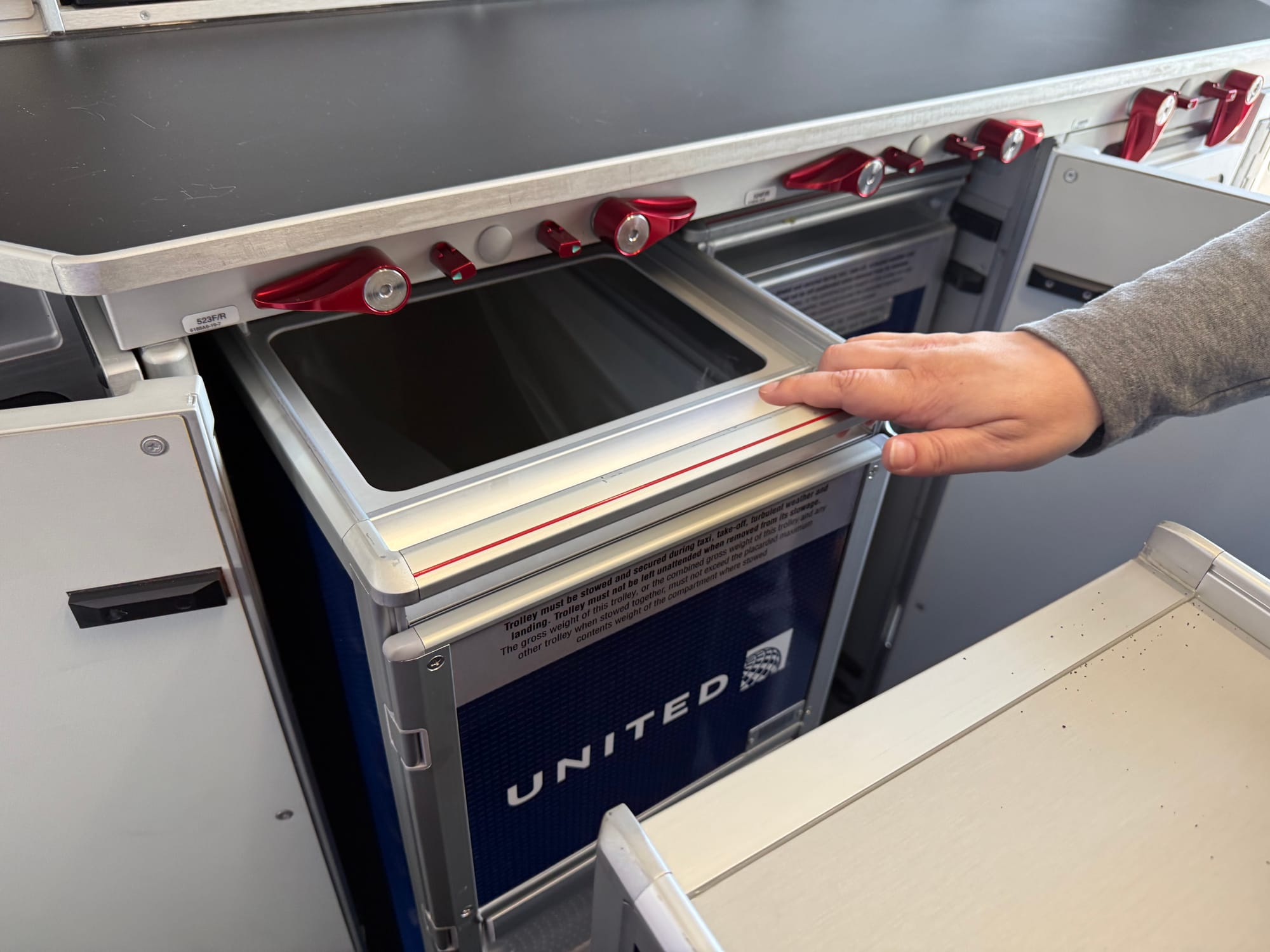
Popping to the rear of the plane while we’re talking galleys, United’s XLR offers Airbus’ new G5XL galley, which brings a bumpout that adds a bit of work surface — but even more two-deep trolley storage underneath.
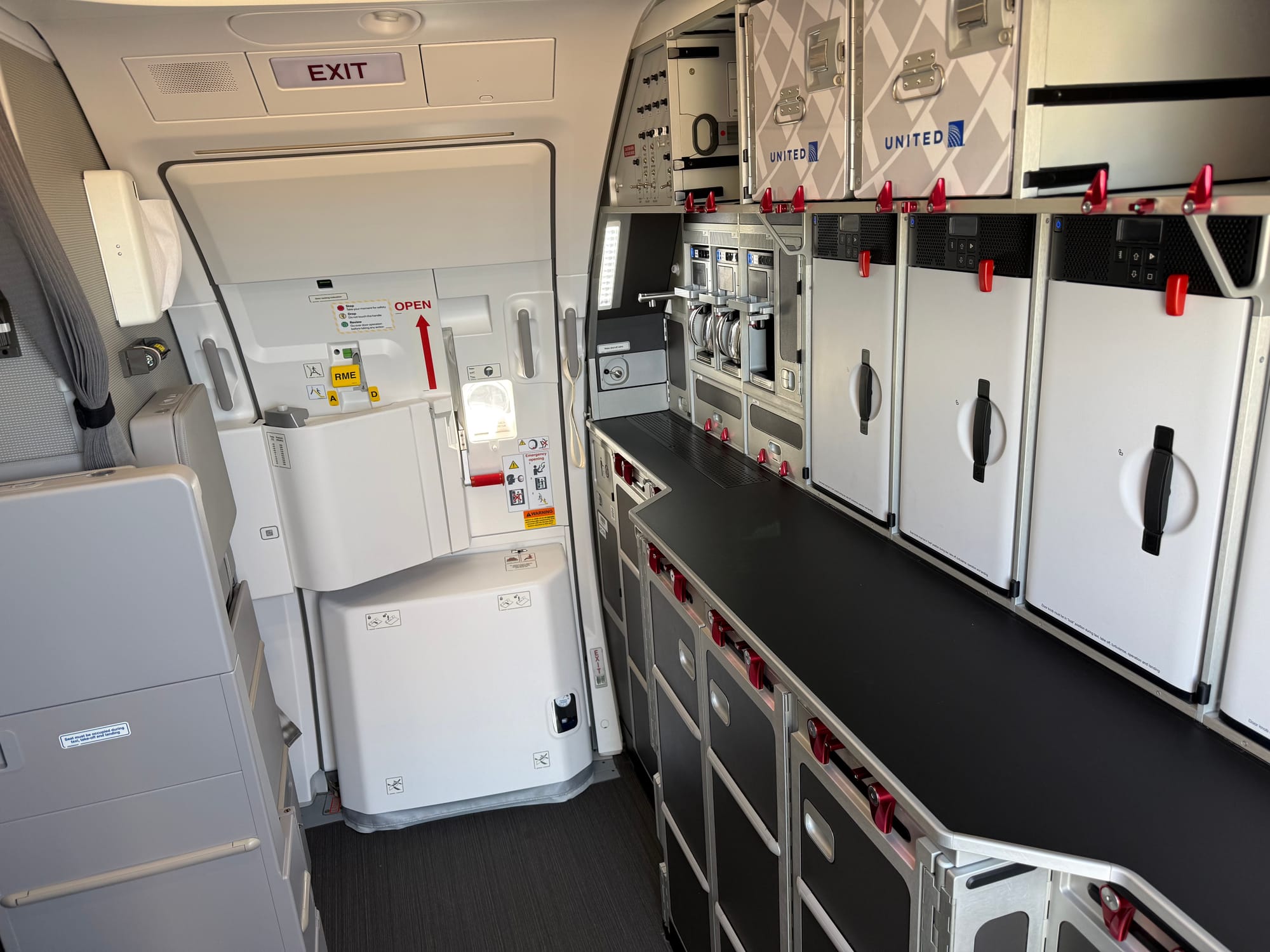
With this bumpout it’s impressively spacious — especially compared with Air Canada’s tiny half-galley on its own XLR — and the amount of trolley stowage is remarkable.
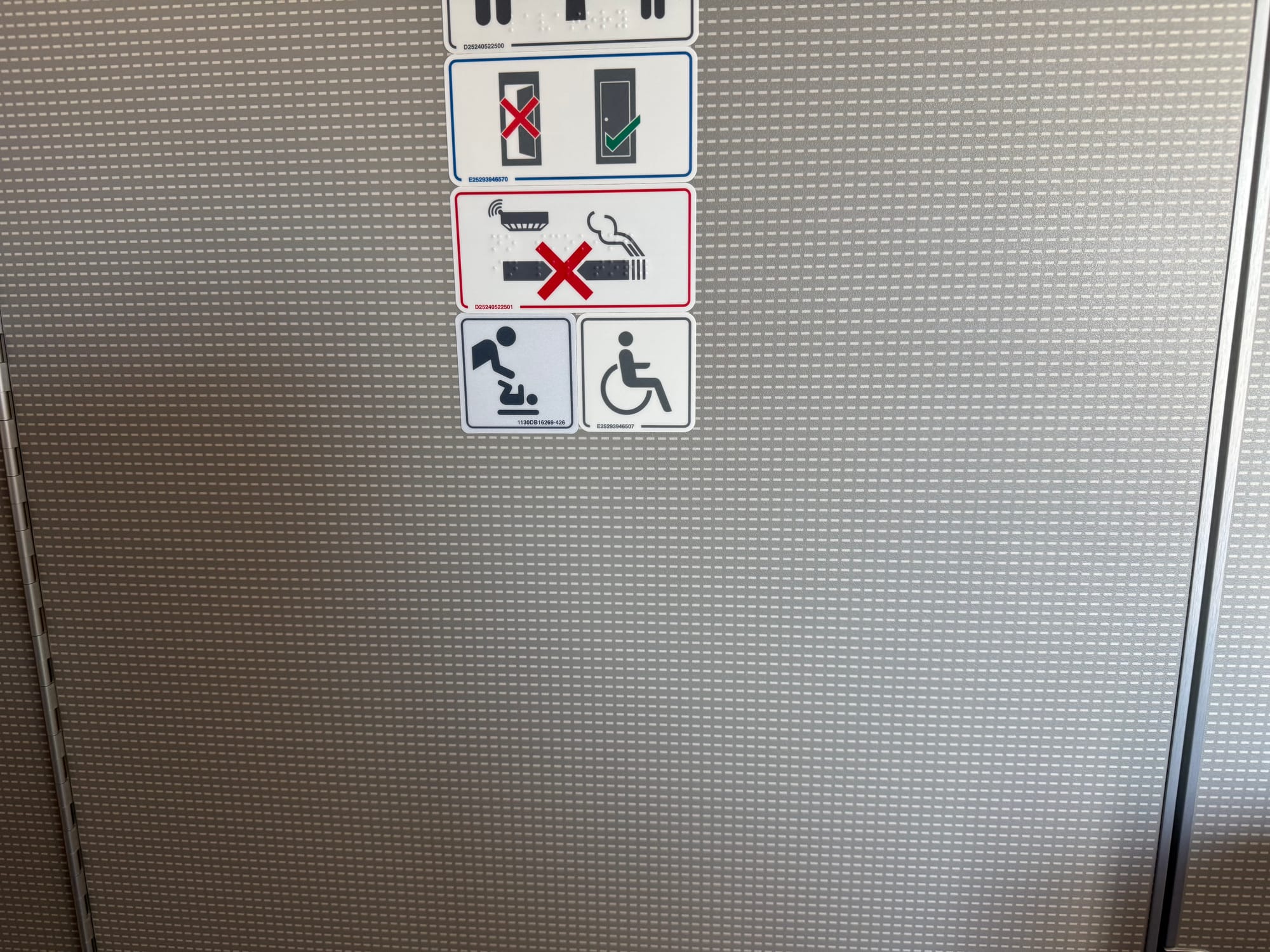
Remarkable for less impressive reasons is yet another supposedly accessible lavatory that’s really just a normal lavatory with a flip-down seat between the door and the toilet, with a wheelchair sticker slapped on the door.
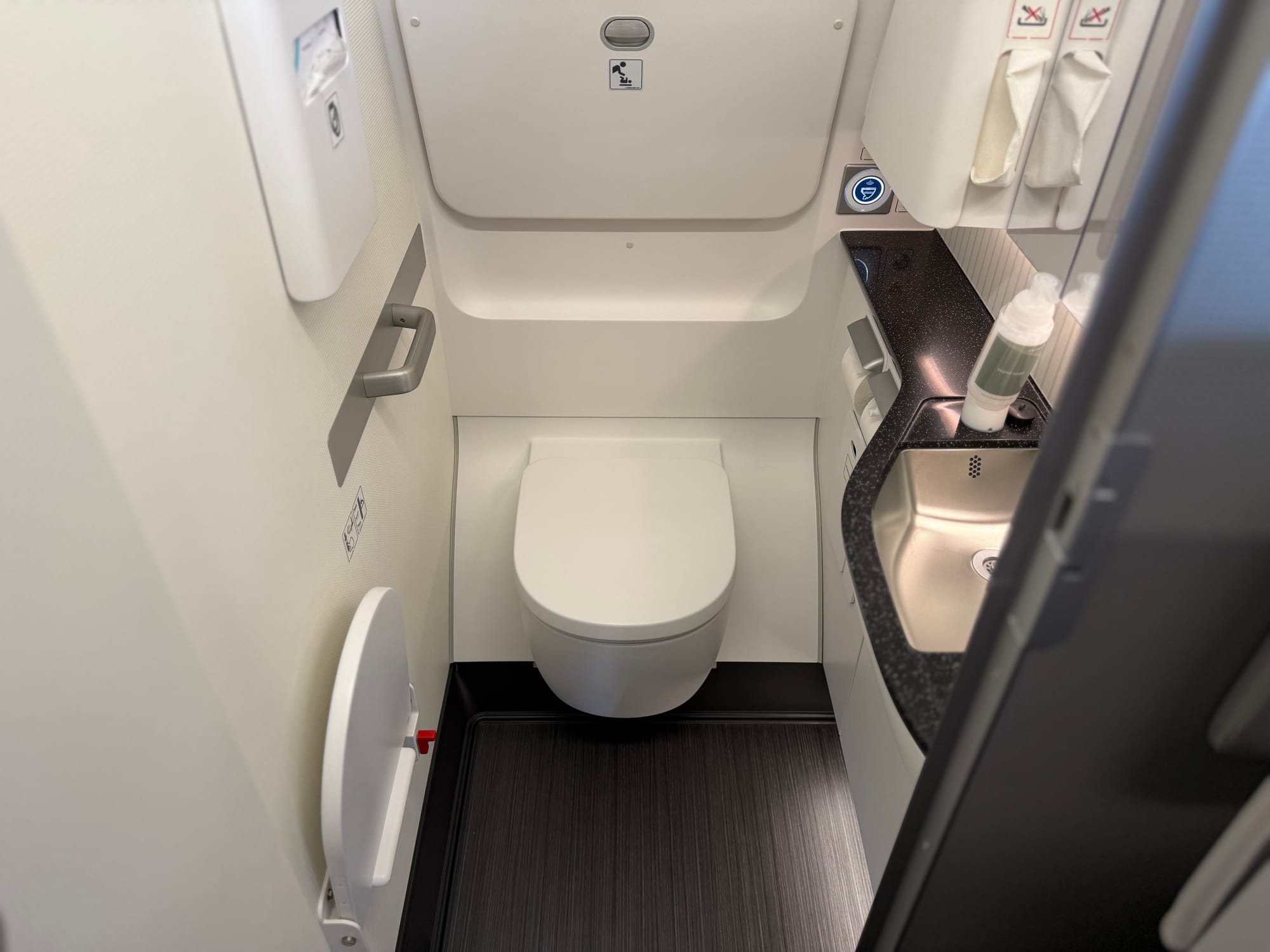
This isn’t accessible in a meaningful way, and you certainly couldn’t get a wheelchair inside. This trend towards marking lavs as accessible that aren’t is genuinely disappointing: the industry needs to do much, much better here.
Aircraft overview: three cabins, five onboard products, and the direct view reason why one of them is Eurobusiness
United’s XLR is highly segmented into five product lines, separated into three cabins:
- 20 Polaris
- 12 Premium Plus
- 118 economy, comprising
- 4 Economy Plus With Extra Elbow Room
- 30 Economy Plus
- 84 regular Economy
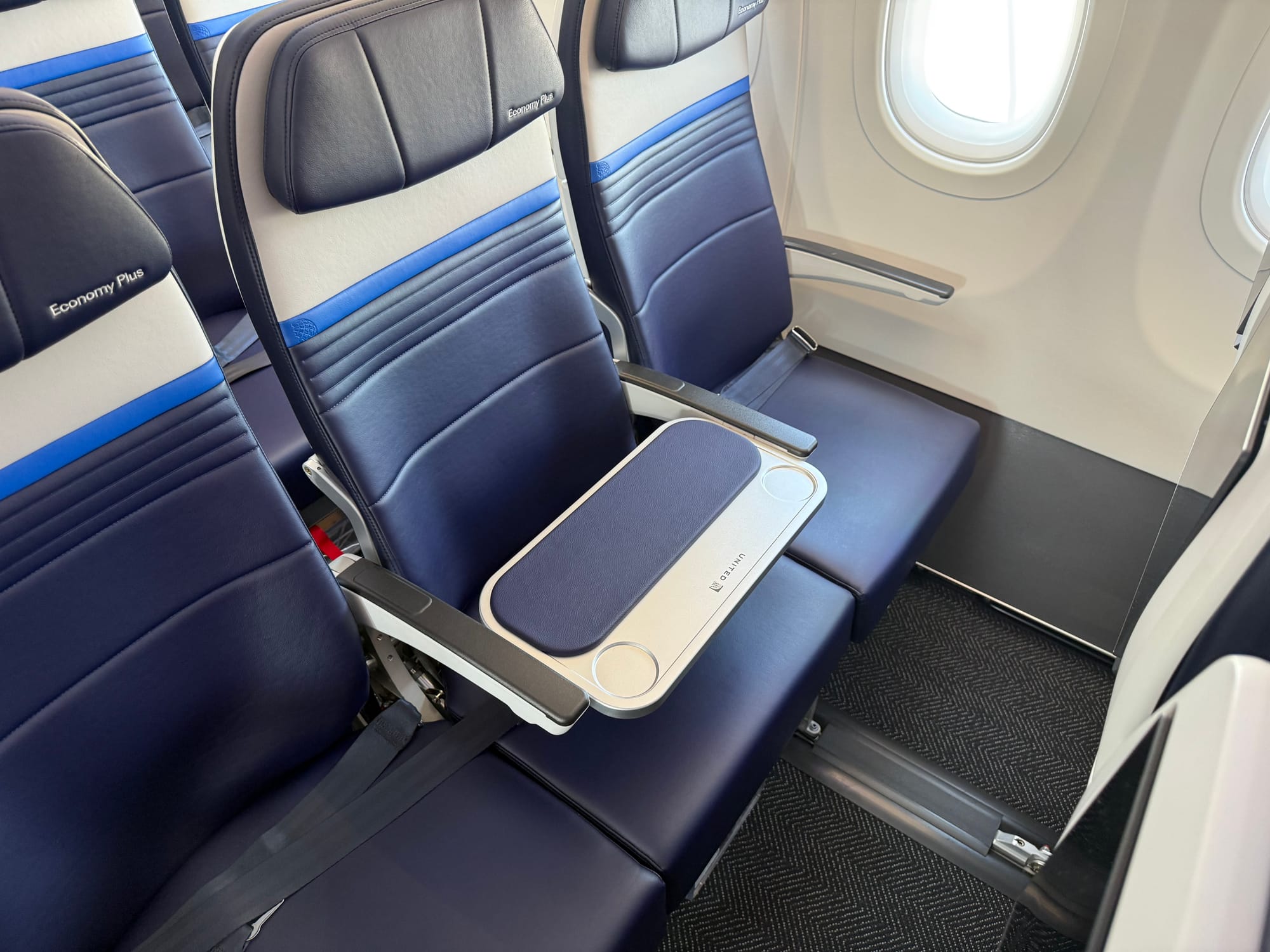
That totals 150 seats, but there are technically 152 on board this aircraft — two (the middle seats of the row immediately behind the exit rows) are permanently blocked off with a Eurobusiness-style table. United is referring to this as Economy Plus With Extra Elbow Room, and is treating it as part of Economy Plus, itself part of Economy, in cabin terms.
Based on discussions around Farnborough and since, The Up Front understands that this was introduced for cabin direct view requirements per visually divided section for flight attendants, rather than than the much more simple flight attendant-to-passenger ratio issues reported elsewhere.
United apparently plans to staff its XLR with more flight attendants than the 150-passenger minimum would require, but it has encountered regulatory approval issues around where those flight attendants are located during takeoff and landing — and what they can see.
The airline has chosen to physically separate its three cabins, creating visually divided zones. There is a substantial galley assembly blocking direct view from the front galley, and monuments both ahead and behind the Premium Plus cabin, which also block views through the cabin.
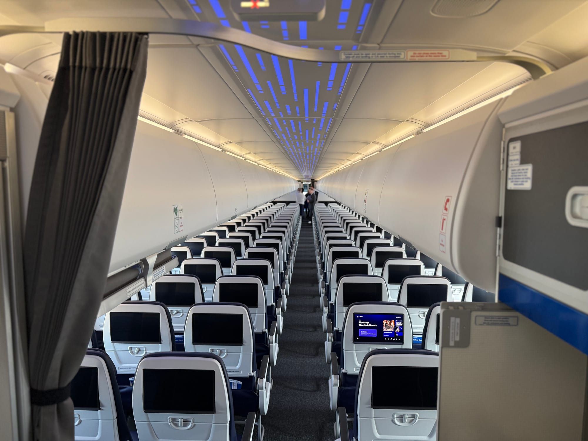
Each section must be considered separately, and this creates two elements we spotted onboard.
The first is the flip-up peekaboo hatch allowing the flight attendants at the front galley to see into the Polaris cabin. Feeling very much like a 1960s hatch from kitchen to dining room, this is, The Up Front is informed, purely a direct view solution and not intended as a pass-through for service.
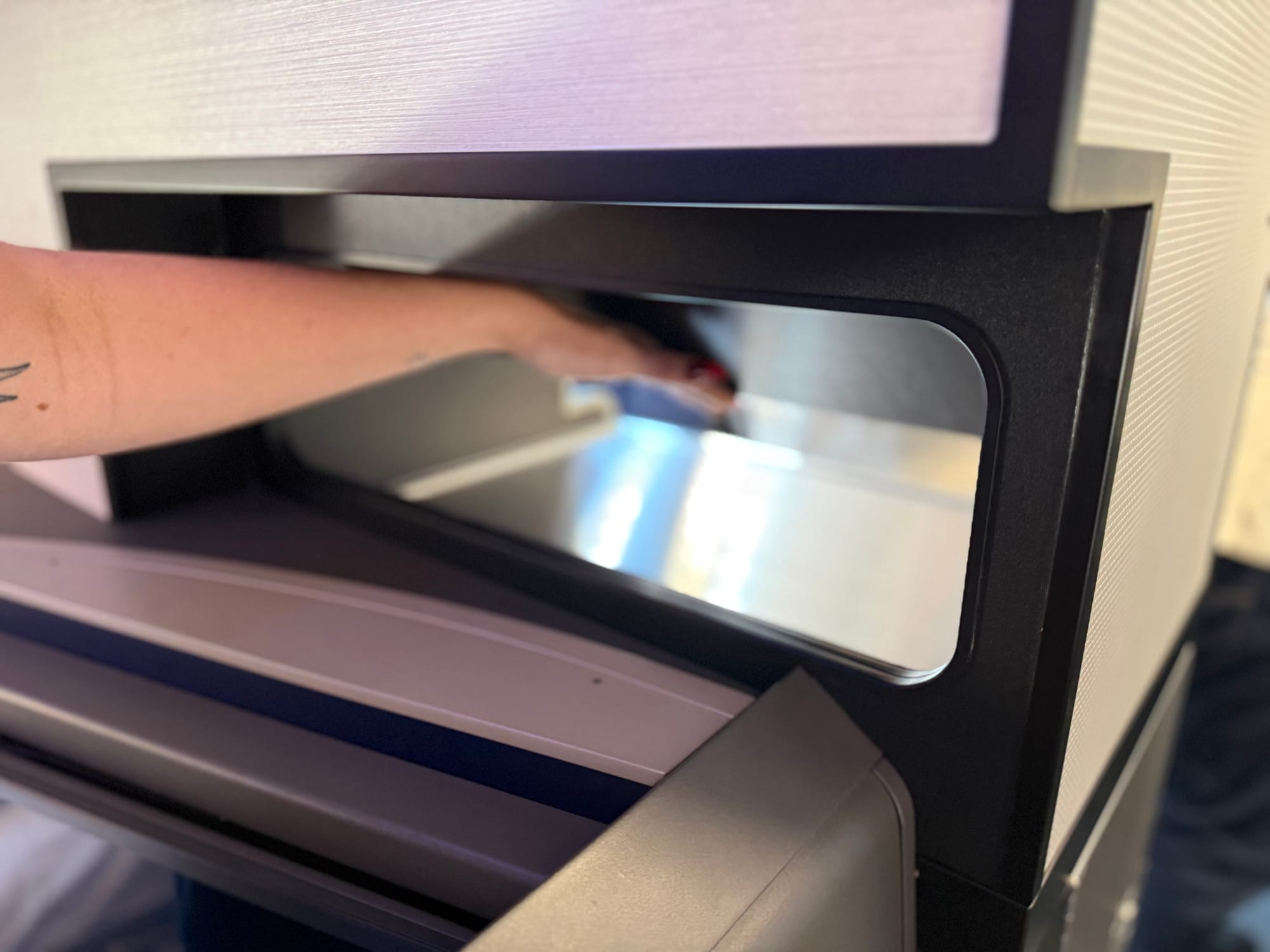
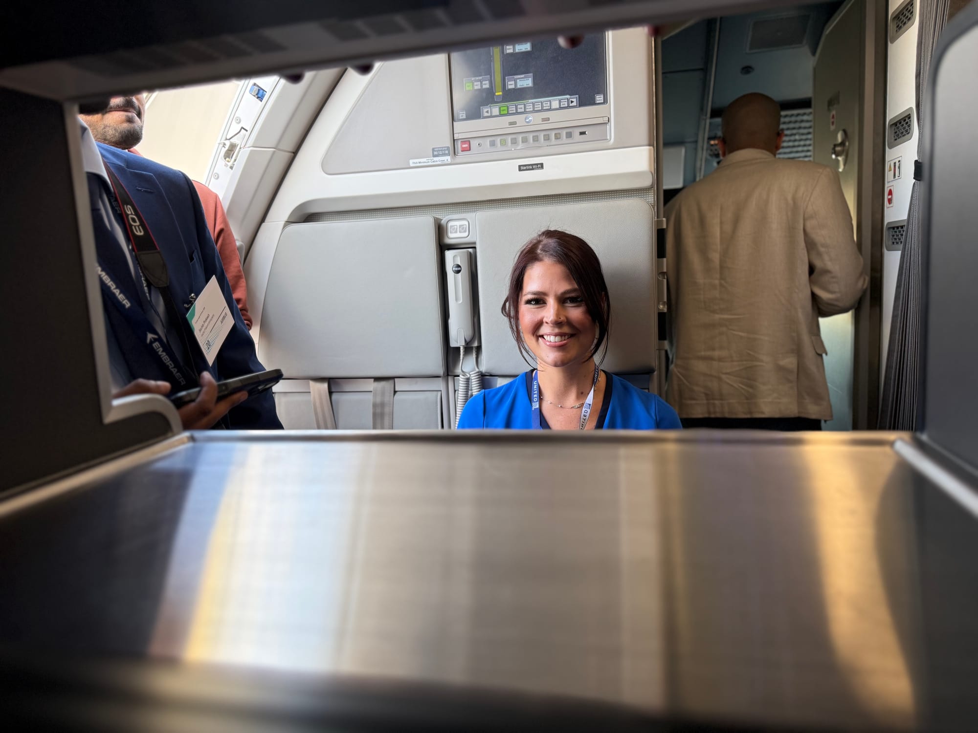
No serving hatch this — it’s purely for cabin view. Image: John Walton
The second is that the economy cabin’s closest flight attendant is seated on the swivel-forward seat mounted on the galley wall that swings into the aisle for use. While some view will be possible down the aisle through business and premium economy, it’s not a lot.
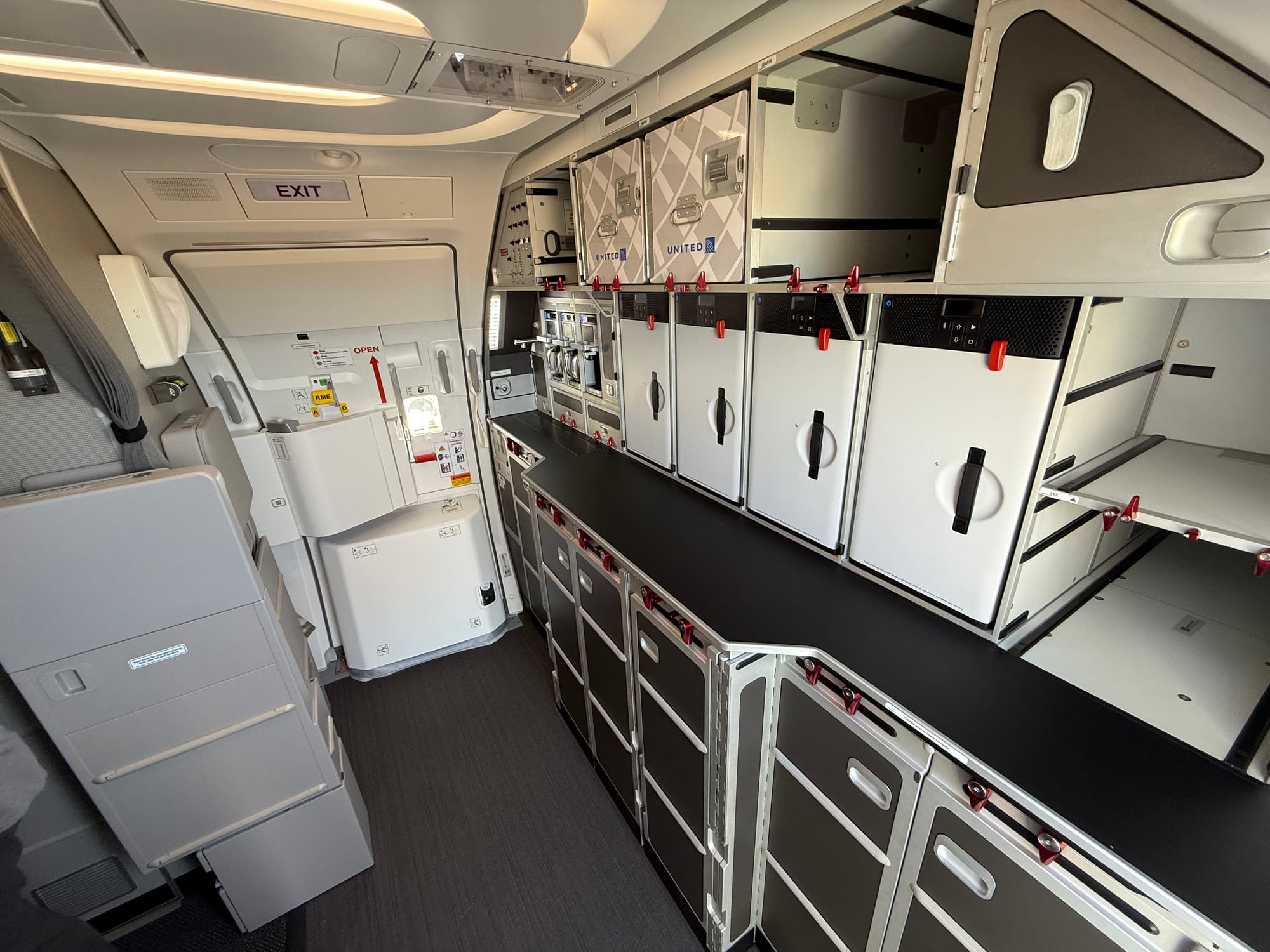
The Up Front understands that regulators did not consider the amount of direct view adequate under the requirements of § 25.785 and equivalent regulations, particularly including subsection (h) (and subsequent advisory circulars [PDF]) for what would have been 120 economy passengers if the Eurobusiness tables were not present.
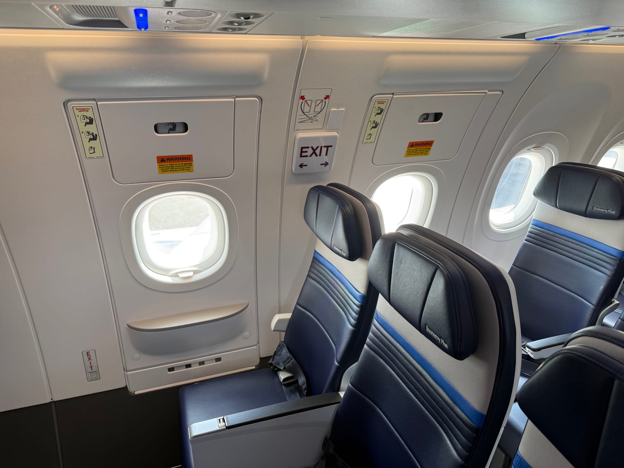
118 passengers, with the two fewer passengers being towards the middle of the aircraft right next to the two overwing emergency exits, is apparently just fine.
Of course, a 150-passenger hard limit would also ensure that the aircraft could potentially operated with minimum crew in the event of regulatory changes of heart, or indeed the resolution of what may well be certain outstanding regulatory inconsistencies.
This gives me some pause about the logic as it’s been explained — I have an aviation philosophical razor argument for never attributing to regulatory requirements that which can be adequately explained by commercial pressures — but it will remain to be seen whether United can eventually operate the aircraft with these middle seats un-Eurobusiness-ed, or indeed with whole-aircraft regulatory minimum flight attendant numbers.
In practice, Economy Plus With Extra Elbow Room is very familiar to anyone who understands Eurobusiness, and feels very much in practice like the latest British Airways table implementation — also on Collins’ seat platform, and with a mechanism that feels very similar, although with a less stylish table than BA’s.
It’s fine: it does what it says on the tin, and if it does prove wildly popular, or even if having two passengers pay to keep the seat empty proves more profitable than filling that seat with a paying passenger, it’s easy enough to expand it to more rows.
Business class: impressive engineering, and many fascinating elements, but the aesthetics date it even in the United Polaris stable
This is the first implementation of Elevate’s new Altitude aisle-facing herringbone seat, which compares with Thompson’s Vantage Solo and Collins’ Aurora in the same sort of style, and with Stelia’s window-facing Opera in the narrowbody direct aisle access stakes.
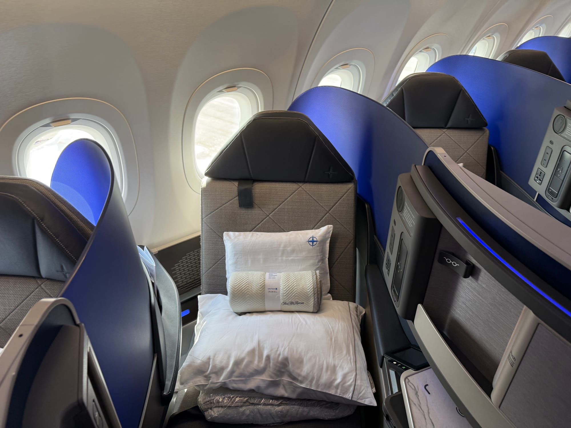
(Safran’s Vue seat was supposed to début on flydubai some years ago and Delta more recently, but seems to have disappeared from, well, view.)
United’s version comes with a door, which the airline confirms to The Up Front will indeed be operable at launch — quite the achievement, although one that might perhaps also point to the length of time certifying the rest of the cabin.
In style, the seat is very similar in layout to Vantage Solo and Aurora, and thus to the original direct aisle access business class seat, Virgin Atlantic’s 2003 Upper Class Suite.
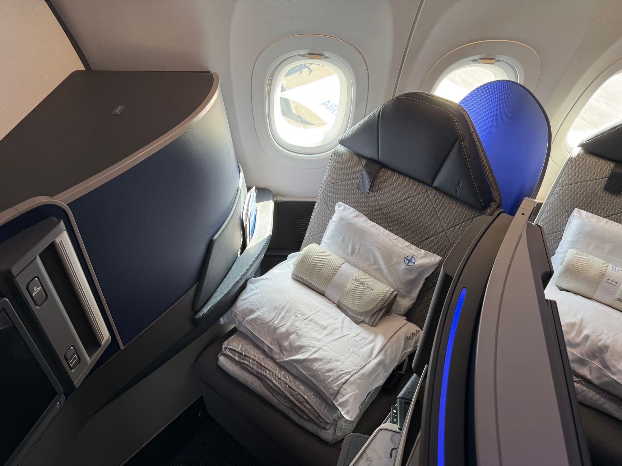
Overall, the first impression of the cabin is decent for an aisle-facing narrowbody herringbone — few people who are not in the “readers of The Up Front” category would likely be able to tell the three current products apart quickly — and it’s all business class seats, no front-row studio class upgrade here.
First impressions of the cabin are fine — that word again — and if the window shades are open in daytime the light hits the large blue dividers attractively. (More on those dividers shortly.) The rest of the cabin does, however, feel a little clunky.
There’s an awful lot of a variety of greys and deep blues, and not a lot of the natural elements that make the new 787 Polaris seats so impressive.
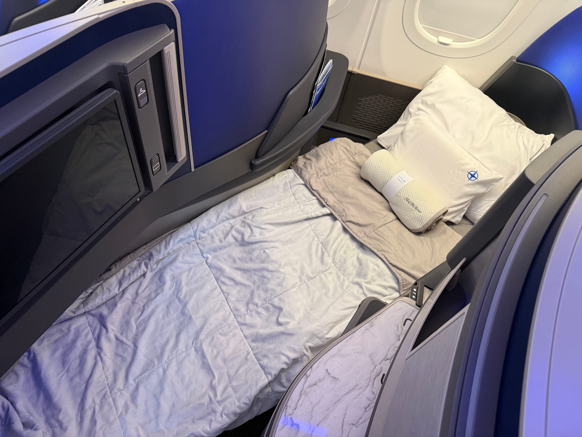
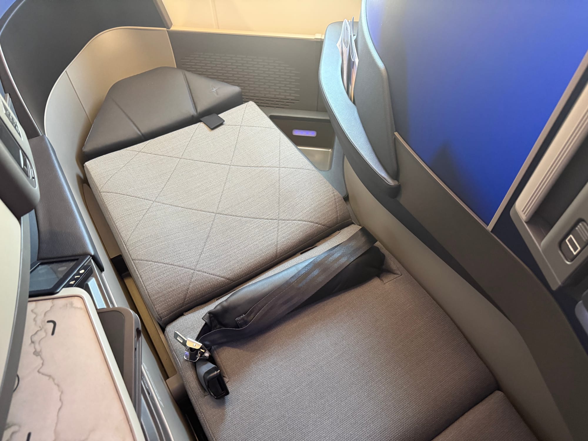
This overall aesthetic is only amplified once you have sat down and somehow found somewhere to store Mount Blankets — that’s my shorthand for the assortment of five soft product elements (mattress pad, pillow, other pillow, blanket, other blanket) arranged in a two-foot pile on every seat that passengers need to dispose of before they sit down.
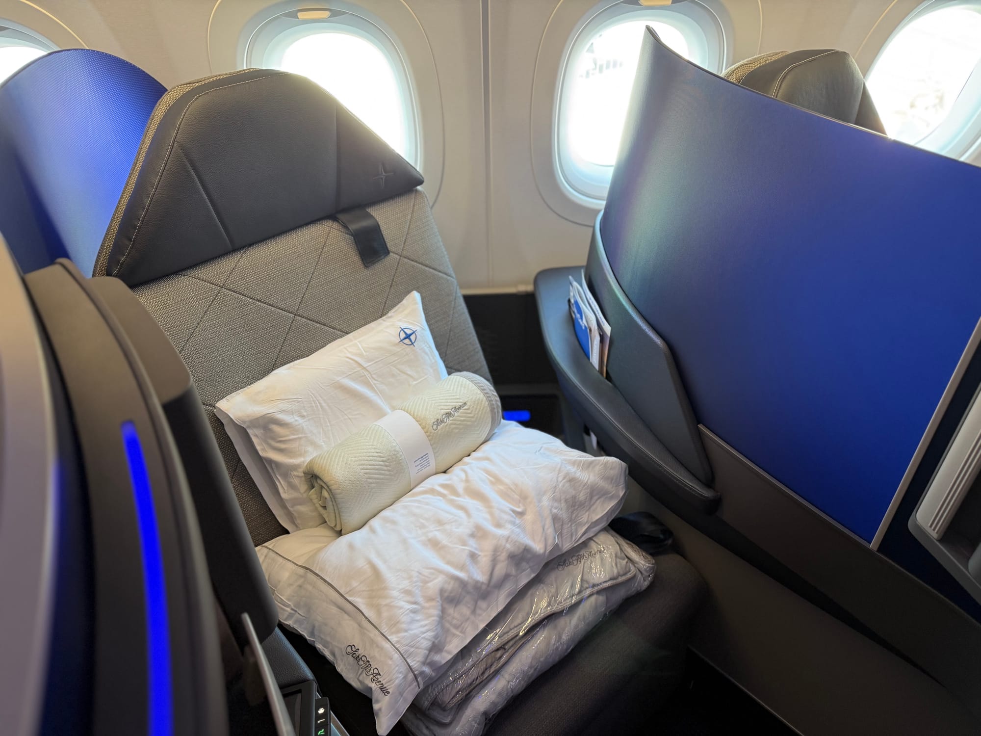
With no stowage space for any of Mount Blankets in the seat itself, passengers have to either clutch this while sitting down or stow them in the overhead bins. (More on what is underneath Mount Blankets shortly too, because that’s, as they say, a doozy.)
This will be especially inconvenient as all 130 other passengers need to get past the 20 business class passengers trying to load Mount Blankets into the overheads.
Once you do sit down, the view from the seat is a little unfortunate: there is a lot of what might be charitably referred to in the historic United context as “dark battleship grey”.
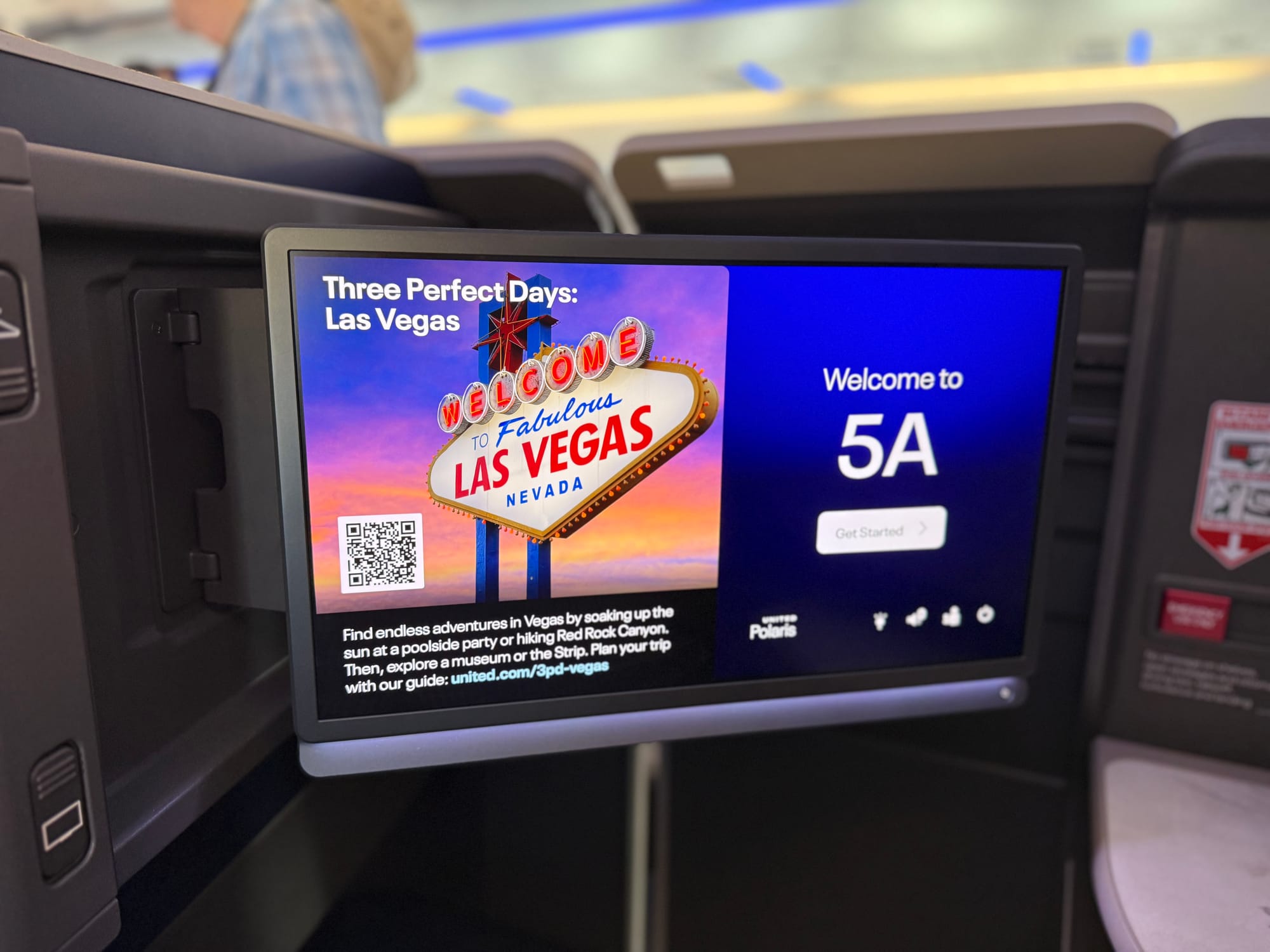
This is especially noticeable once you close the door, which will be most passengers’ views for most of the flight.
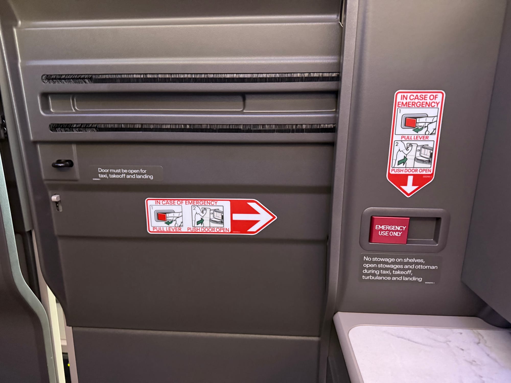
That monochrome, monotexture deep grey plastic comprises everything from the monitor surround to the footwell, the walls of the telescoping door assembly and the door itself. There’s also yet another emergency secondary door release function, for those of us collecting them.
To be honest, original Polaris does a better job of breaking up the eyeline aesthetically.
I have mixed feelings about the activation buttons for elements like the screen release and the coathook.
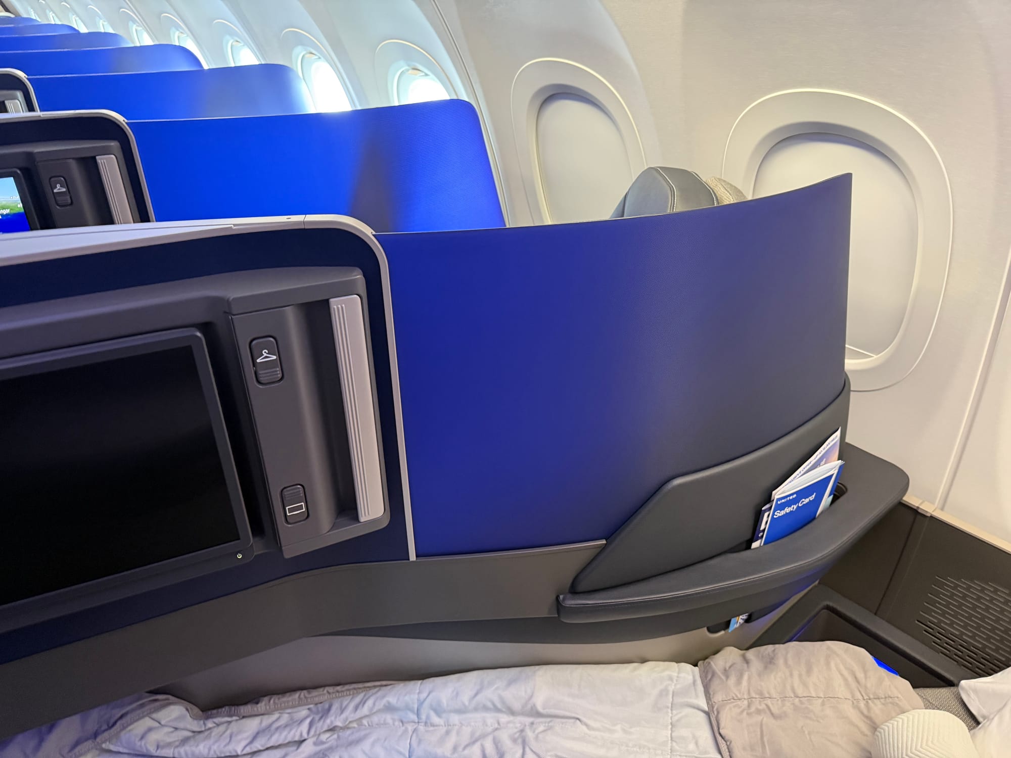
On the one hand, the textures on the buttons (and the physical buttons for seat control on the other side of the suite) are a plus for accessibility, although they are in the same dark battleship grey rather than one of the contrast colours, and are not differentiated in a tactile way, with one raised line for monitor and two raised lines for coathook, for example.
On the other hand, the buttons tthemselves feel a bit too big and clunky — perhaps this is just the life stage I’m at right now, but there’s a certain Fisher-Price My First Airplane Seat feel to them, except without the bright colours, which would also have been better for accessibility.
Surely there is some happy medium between accessibility, durability, aesthetics and a certain joie d’usage that would be possible here.
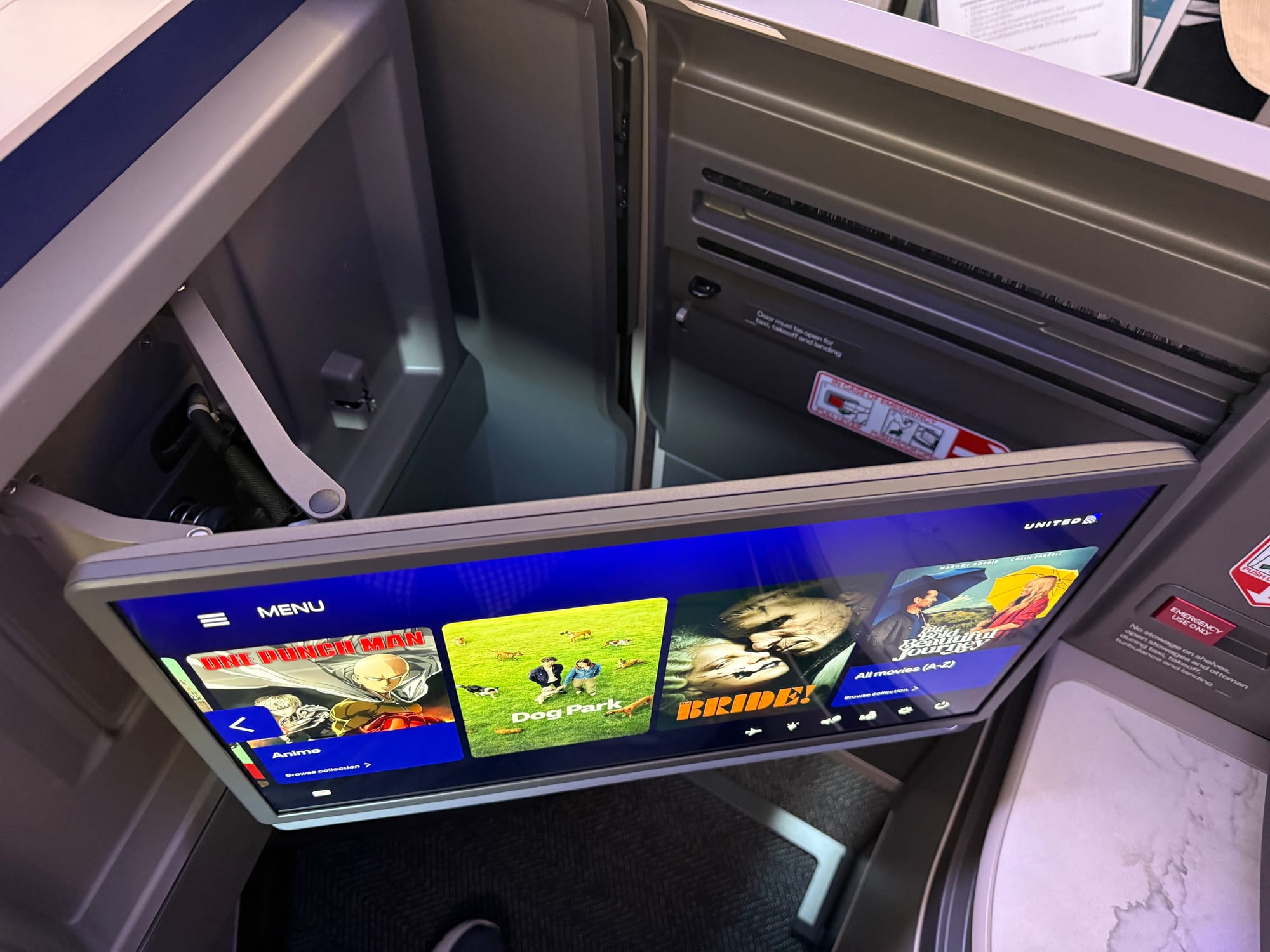
Thank goodness for Panasonic’s Astrova system and how modern it looks, because that’s the only bit that doesn’t feel like it fell out of the mid-2010s and hit every branch on the Clunky Grey Thermoplastic Tree on the way down.
It’s not quite as good as the Air Canada XLR version on Aurora, though, but that may just be a delayed programme timing issue where that seat was revealed first.
There are also, alas, no outside cameras on this XLR, which is a shame. I realise they’re an extra cost from Airbus, but they were such a delight on Air Canada that it’s now an even bigger disappointment not to see them.
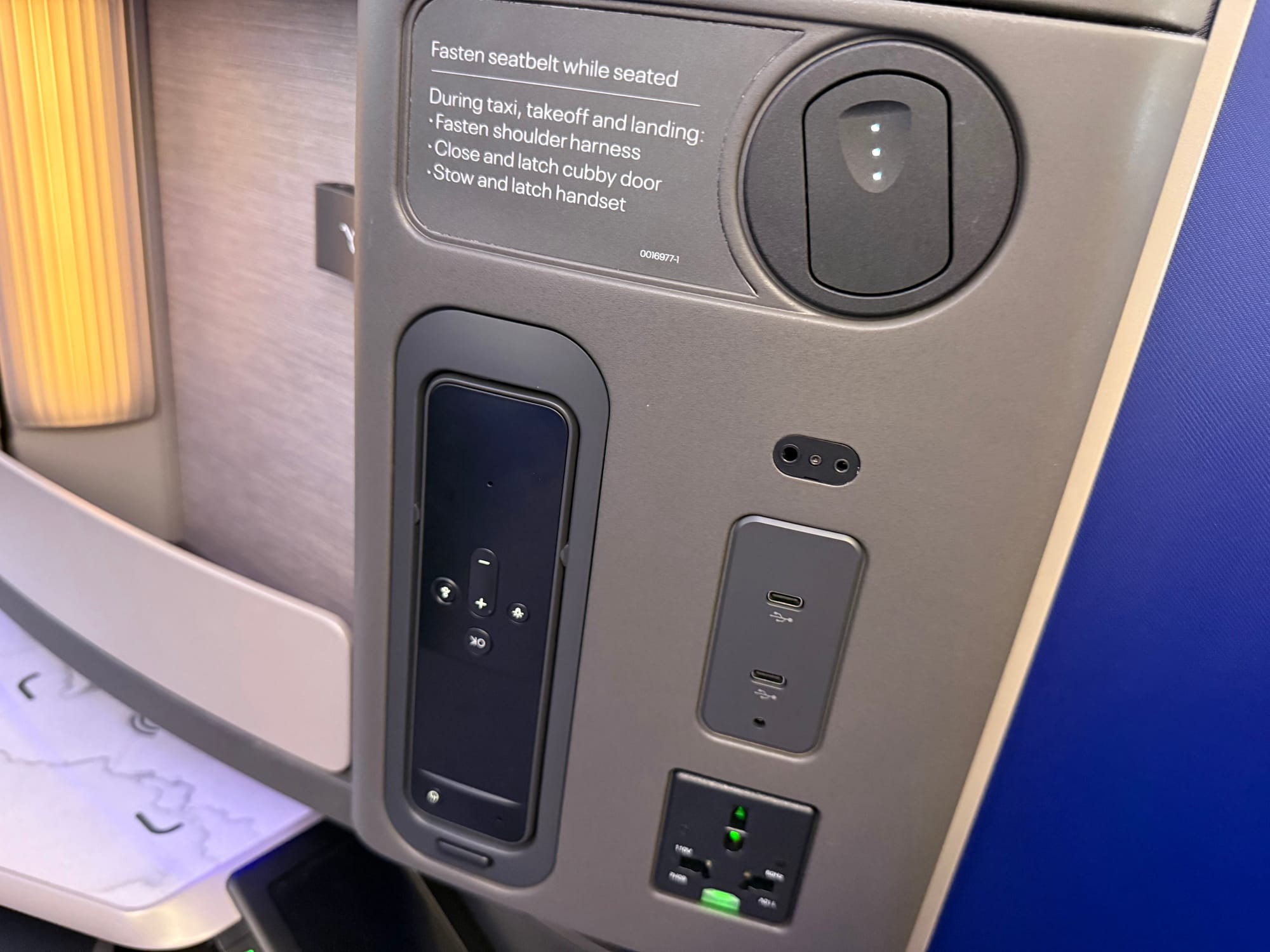
The Astrova remote control is also installed upside down on every single seat, and Richard D’Cruze of JPA Design tells The Up Front that, “with limited space in seats, packaging of seat technology is not always ideal — in the case of this seat it's caused by the need to accommodate the cable reel for the handset.”
This raises more questions: are the buttons on the remote used more when it’s docked or pulled out? And second, with a responsive touchscreen in easy reach, do we need a remote entirely?
(I’ll note at this point that the timing of Astrova, revealed in 2022, seems to line up after the initial development of the seat, so presumably it was originally designed for Panasonic’s short-lived NEXT system launched in 2017.)
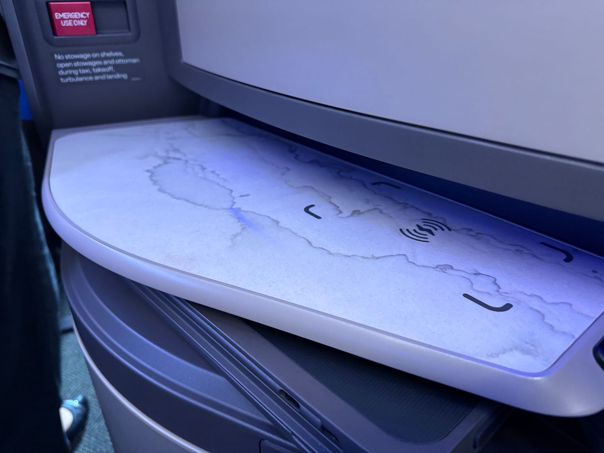
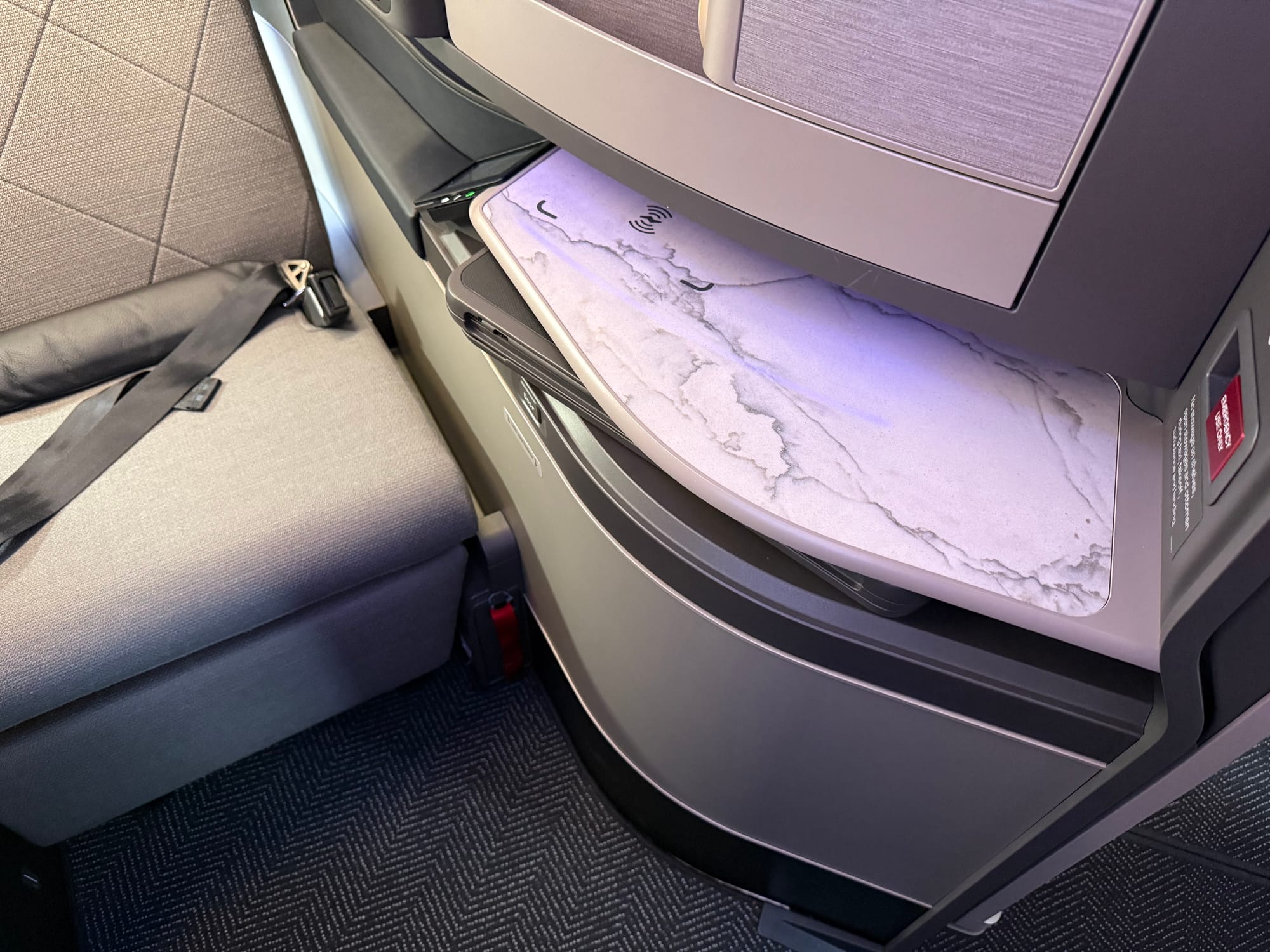
The large F/LIST real stone side table is also an excellent choice. F/LIST returns to United here (the airline was one of the CMF specialist’s earliest commercial aviation customers) and contains a wireless charging point. It’s the most visually premium element of the suite, which otherwise feels a too close to the original Safran Optima-based Polaris than the new Elevate Ascent-based Polaris in aesthetic.
But overall, everything just sticks out a little clunkily. The screen-door-wall view is ugly and grey, the tray table doesn’t sit flush under the side table, angles and radii aren’t constant, thermoplastics and leather/leather-effect materials aren’t textured… and it just looks a bit old.
The outstanding piece of the puzzle — and what makes the 32-inch, 49-degree density work, even with certification issues — is a piece of 3D Boltaron variably translucent thermoplastic
To have a business class seat pitched at 32 inches, with a 49-degree angle away from the centreline, is quite the impressive engineering achievement. (Some reports online cite the pitch as 28”; United confirms to The Up Front that it is 32”.)
At that angle in particular, the pitch and seat width interact in ways that are new to passengers, especially around the shoulders.
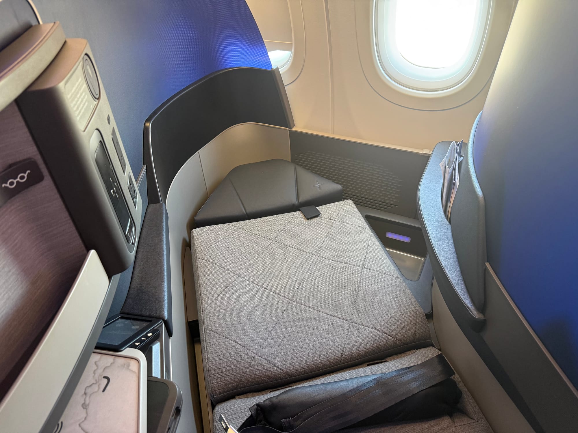
This seat (at this pitch) can’t be said to be wide at the shoulders at, but fascinatingly enough the pinch comes more in bed mode than in seat mode.
That’s thanks to the piece of thin, curved, variably translucent blue thermoplastic that forms the divider between each seat. Approximately 1cm thick, it replaces what is usually a substantially thicker wall assembly that often takes up 5cm or so.
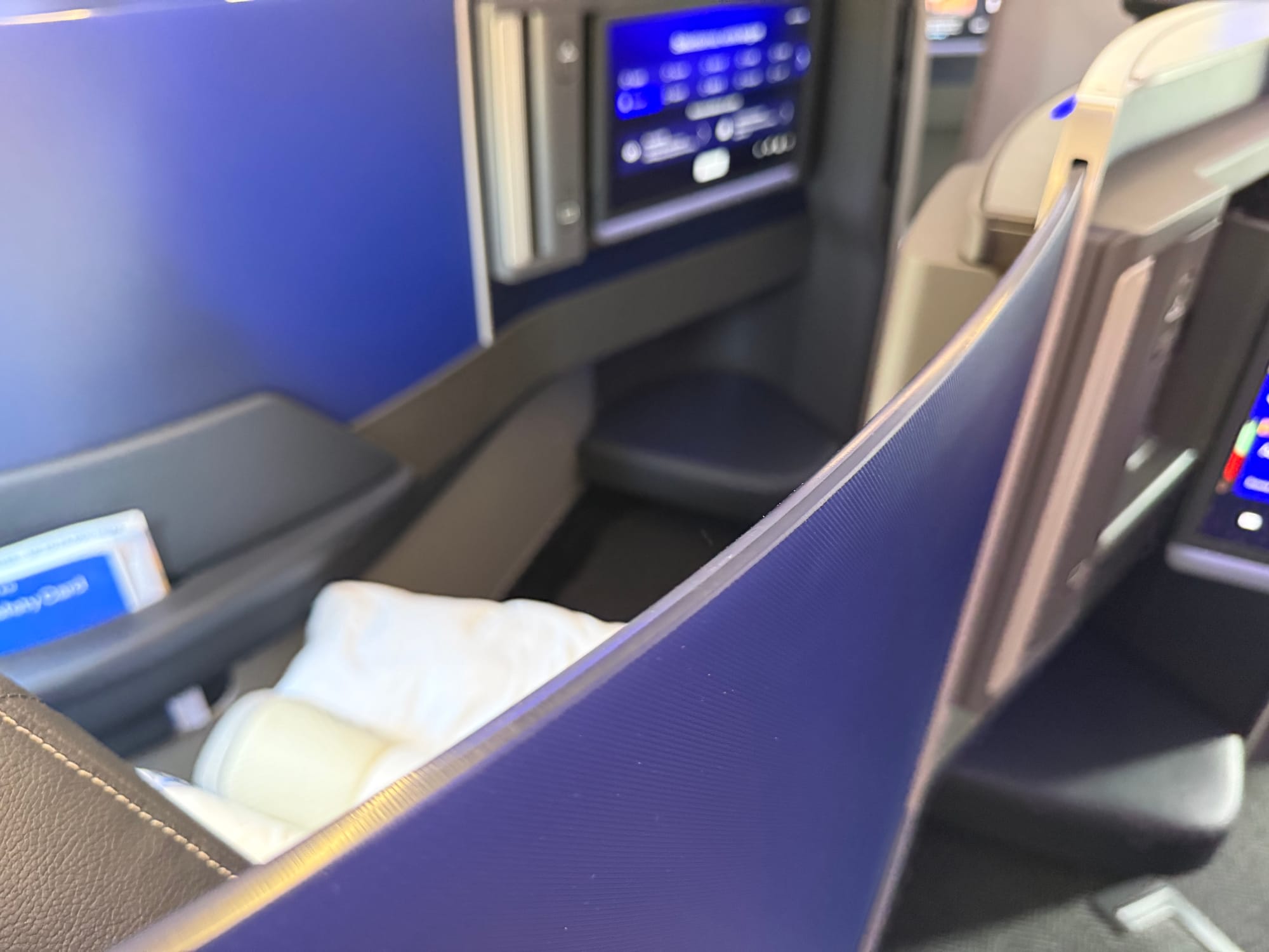
The variability in translucence is particularly smart, allowing more light to pass through closer to the window, but becoming more opaque in areas where one might otherwise see the movements of the passenger in front.
This is a collaboration between PriestmanGoode and SIMONA Boltaron, the latter’s John Inman tells The Up Front.
“PriestmanGoode designed the artwork, and they designed a gradient pattern with a variability of dots from more to less, so that that had a different level of light transmission,” Inman explains. “We then trap that film, which we make and print, between the plastic sheet, which we also extrude, and then we put a special texture on, which they chose — which is our WR texture, a pressed texture — and then we thermoform the part.”
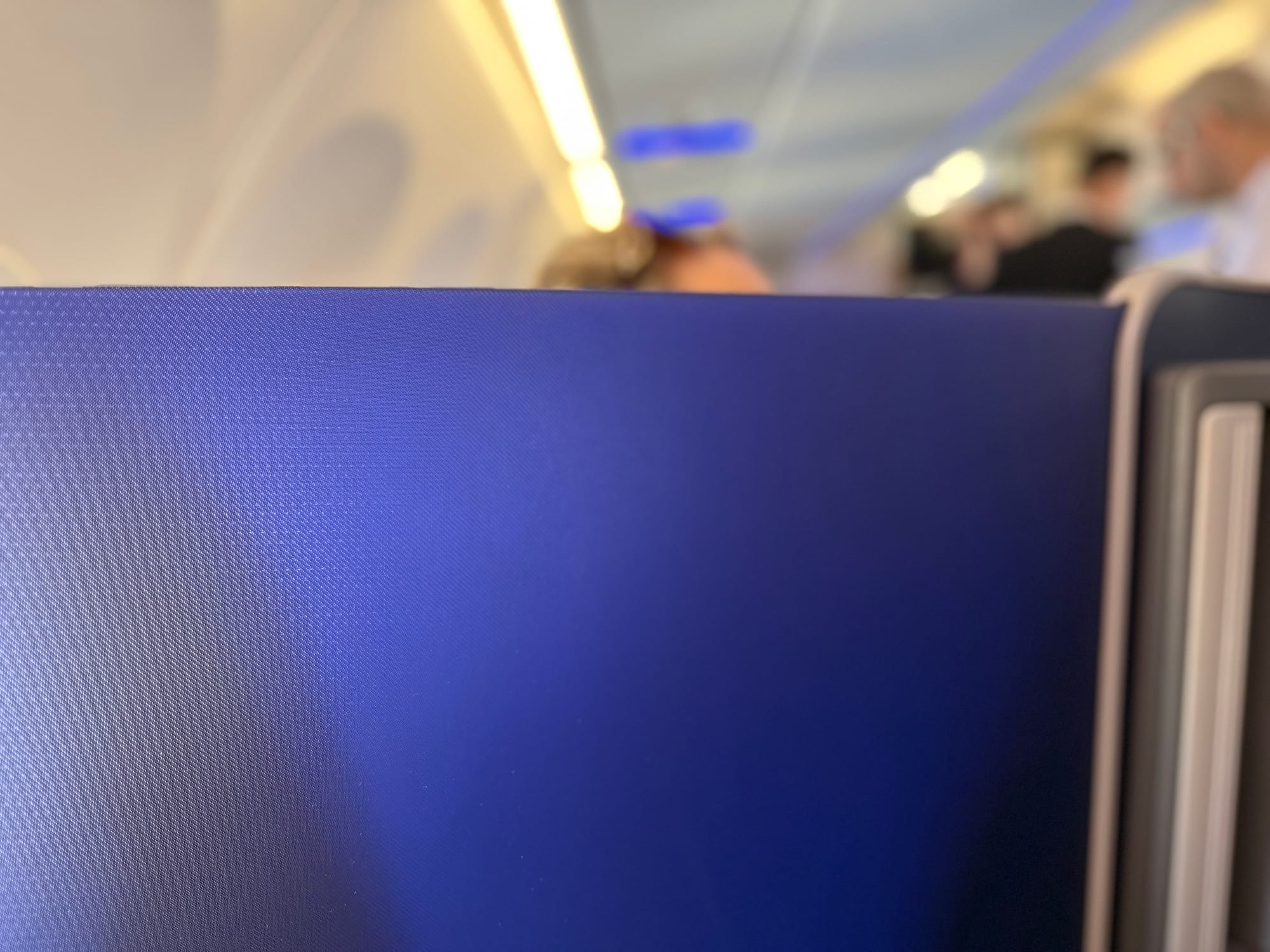
Overall, it’s genuinely impressive as a spacemaker.
It is, however, plain that there have been certification woes along the way around head impact. This is a relatively thin piece of material that’s directly in the passenger headstrike zone, and that has clearly required additional mitigation.
Hidden neatly under Mount Blankets is a lap belt airbag, in addition to the third point overshoulder belt on the seat. This is, as I understand it, unprecedented, and The Up Front is informed that this is required as “part of the certification process” by a person directly involved in the process.
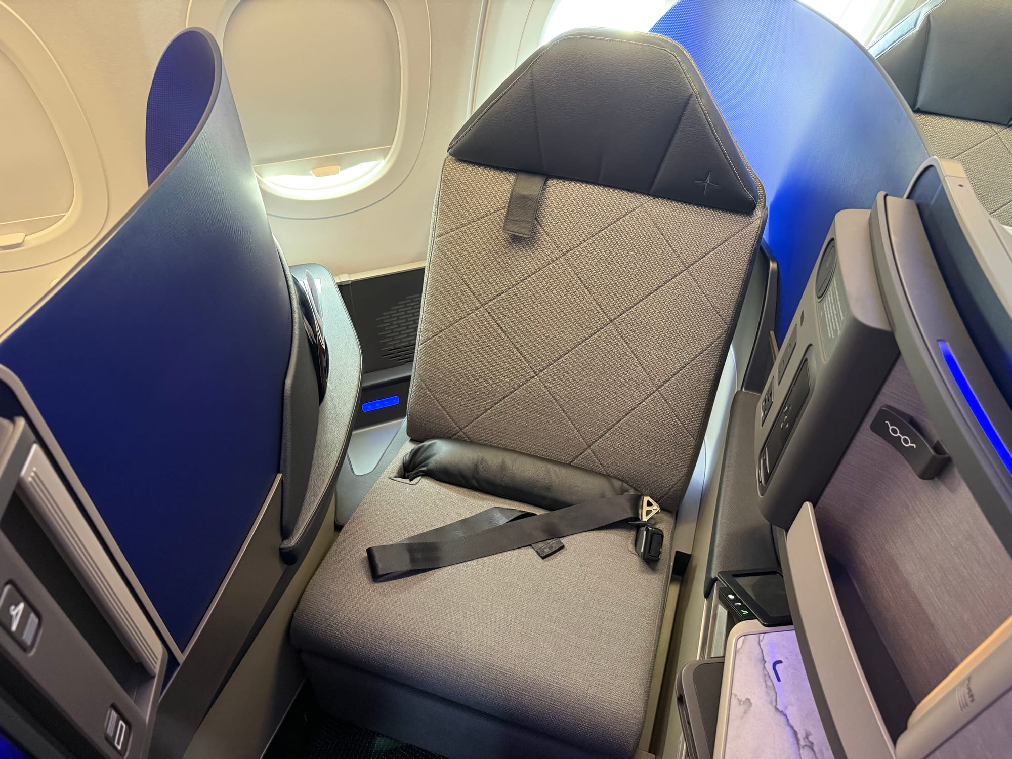
To the best of my knowledge, and the knowledge of the numerous industry experts I consulted, no other seat has required both a lap airbag and a three-point seatbelt to pass certification — instead, seatmakers have chosen to make changes.
It’s notable that both lap airbag and shoulder belt are in place here, though the level of read-across to other seats and even other airline programs using this seat may be relatively minimal. The delay to the seat in pure time terms, and the context of evolving regulatory requirements (both independently at the FAA/EASA and the recent developments hosted by SAE) may mean that both safety elements are not required the next time the seat is assessed.
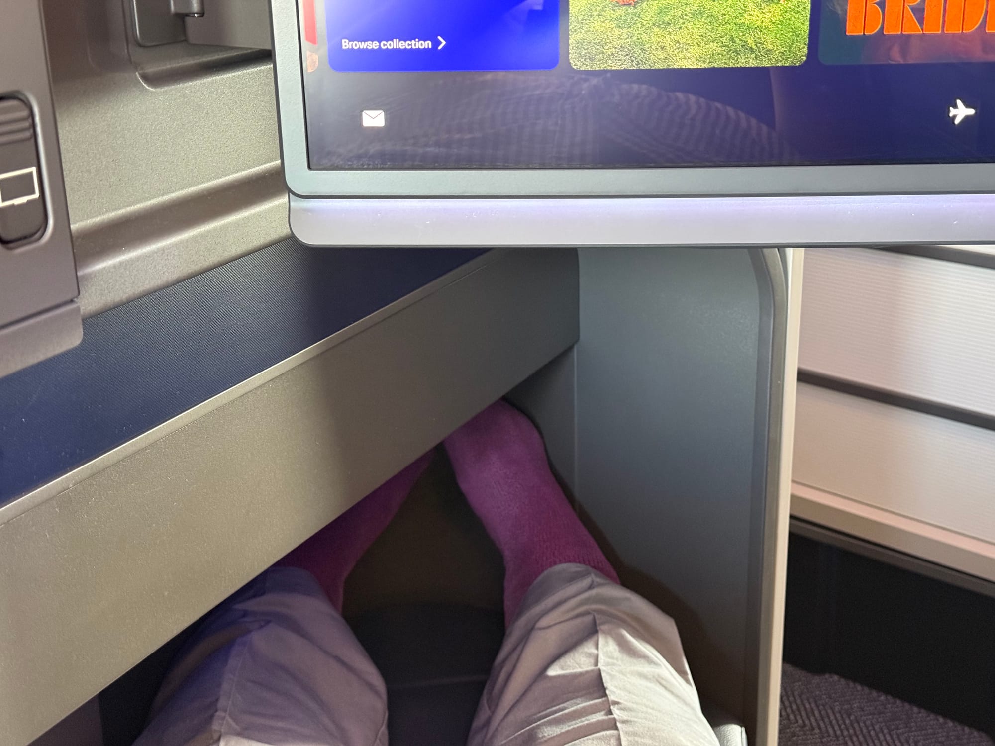
In bed mode, it was again fine: not the most spacious nor the longest bed, but for a brief transatlantic overnight you’d probably get a decent nap. I think Air Canada’s implementation of Collins Aurora is better, but that one doesn’t have doors — although, frankly, I don’t think they’re needed here.
Pluses, minuses and averages across premium economy and economy — and the bins and lavatories
As we move back in the aircraft, some further notes. Premium economy is fine, but doesn’t really stand out: Collins MiQ with the privacy headrest we’ve already seen, the nice F/LIST cocktail table that United launched on recliners last decade, and a big Astrova screen (again, not United’s first). It does, however, stand out in width and in no-middle-seat terms above United’s other premium economy longhaul seats.
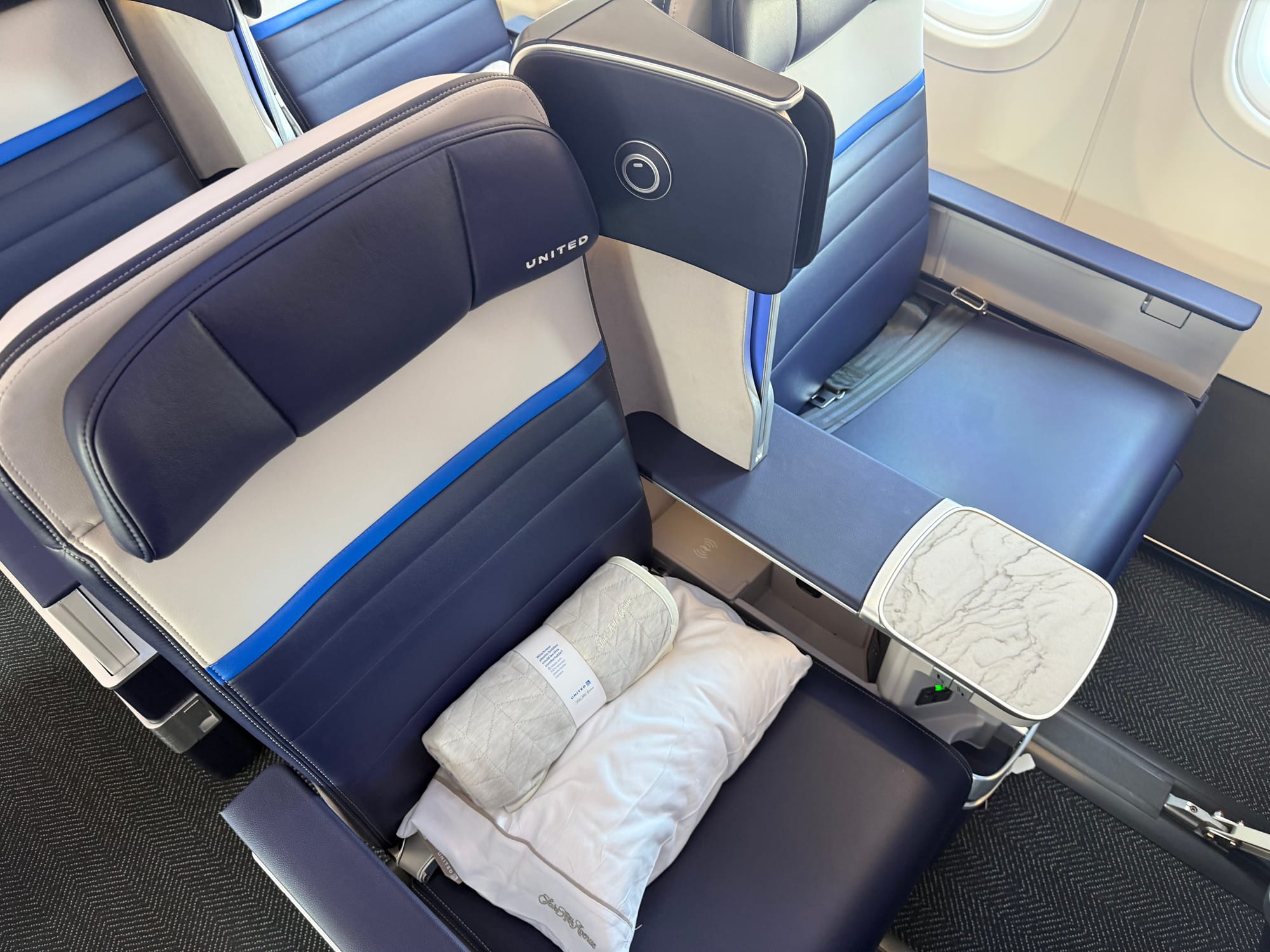
Not to be very on brand here, but the most striking part is a new divider between premium and regular economy, which has very sturdy legs indeed that give space for economy passengers’ feet to stretch out under the divider towards the premium economy seats. The Up Front understands this is from Boeing’s EnCore outfit.
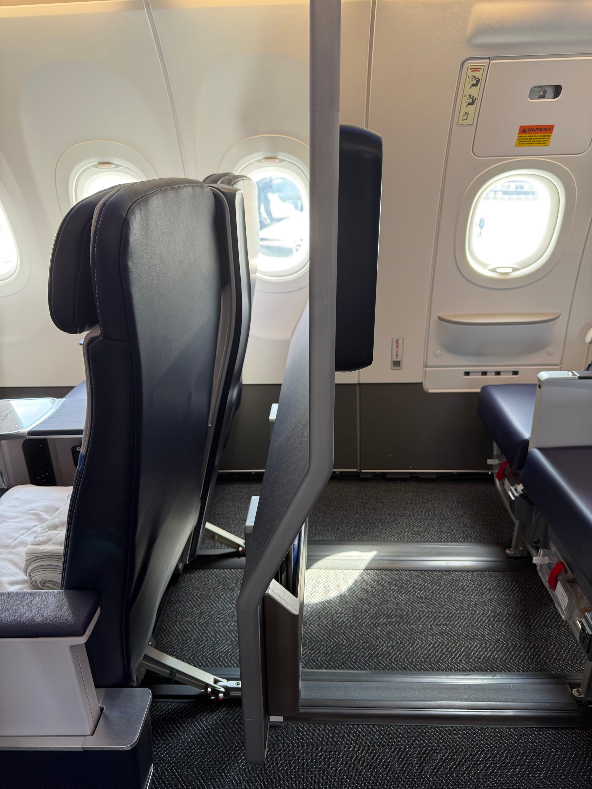
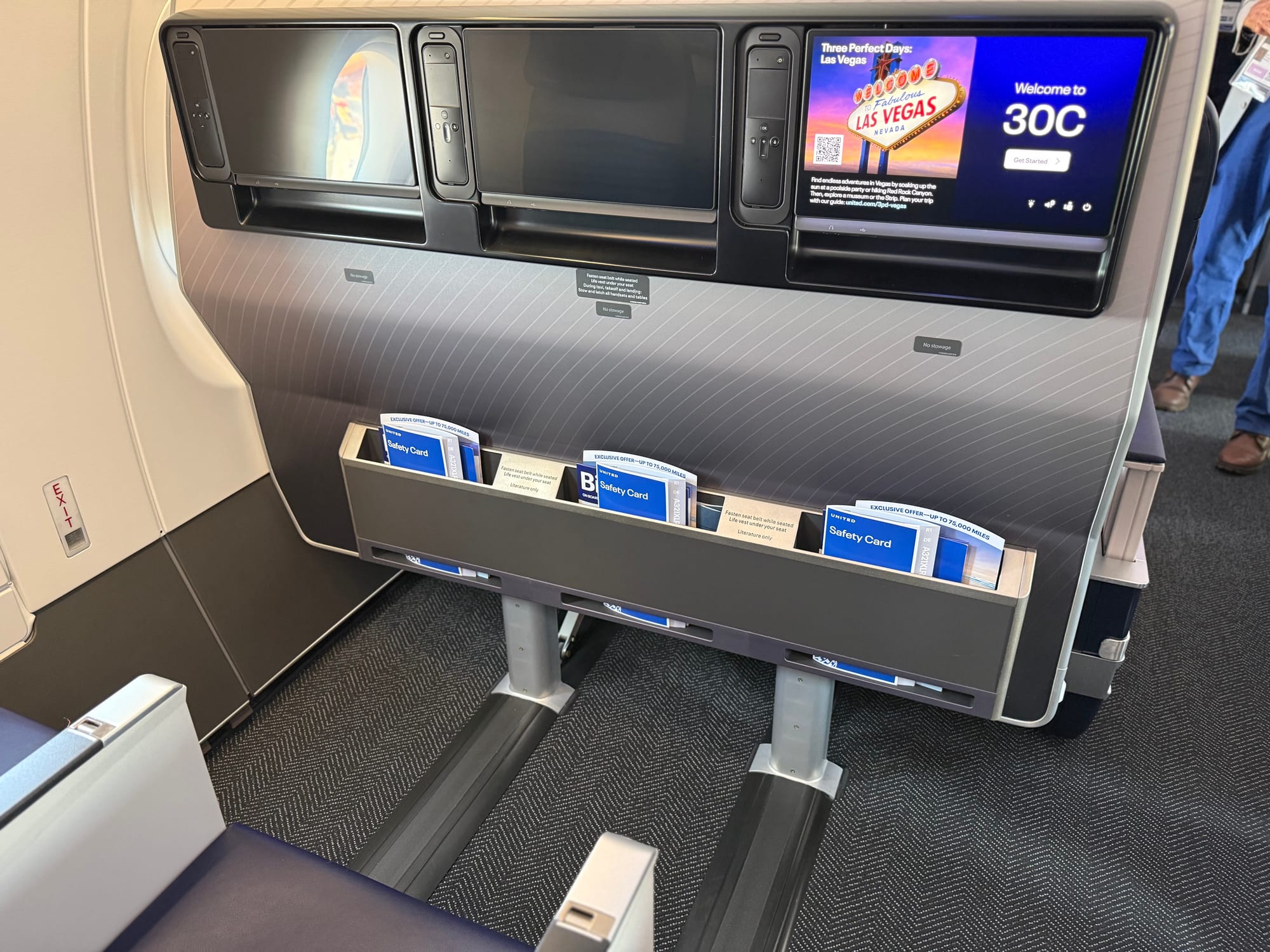
While good for legroom, one does have to wonder if those bare metal legs could have been covered with something, given that passengers’ ankles will be brushing up against them. Image: John Walton
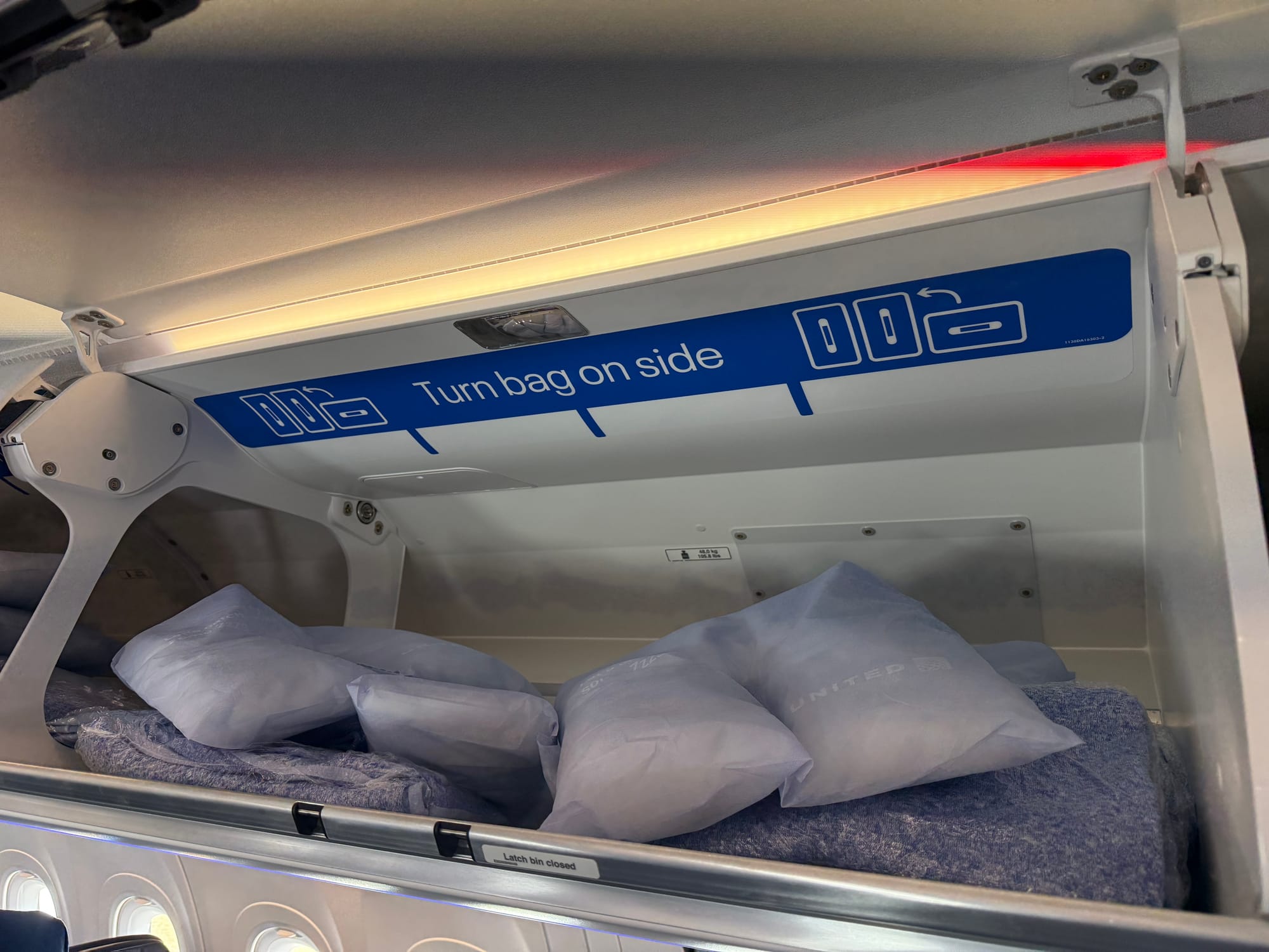
Inside the overhead bins throughout the aircraft, United has its own extra-large bin placards directing passengers to “turn bag on side”, suggesting that its experience with the Airbus standard placards hasn’t been clear enough for passengers.
The economy seats, pitched at 30”, were surprisingly poor in terms of shin clearance in United’s version of Collins Meridian+. I’ve sat on these seats at various pitches at AIX, and indeed on Air Canada’s A321XLR just a couple of months ago, but there’s something different about these.
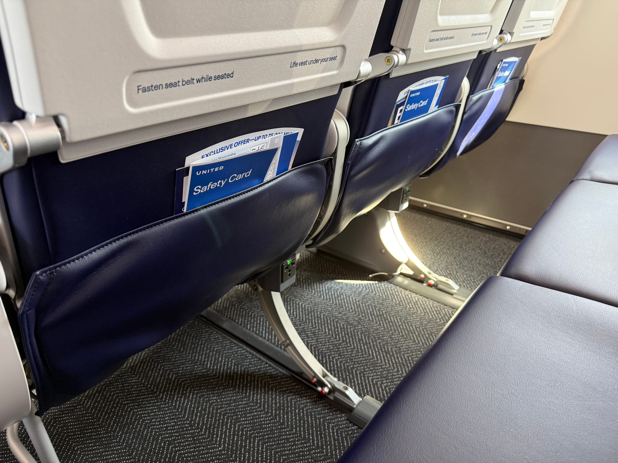
It doesn’t feel like it should be down to pitch, exactly, even though The Up Front understands that the Air Canada seats are pitched at a minimum of 31” where the United version are at a minimum of 30”, but this is really about shin clearance, and my shins haven’t moved from where they were last month.
The back end of United’s XLR is quite the busy space: there’s a self-service snack station, three lavatories (behind the seats, not on the rear bulkhead wall), and the new, larger G5XL galley.
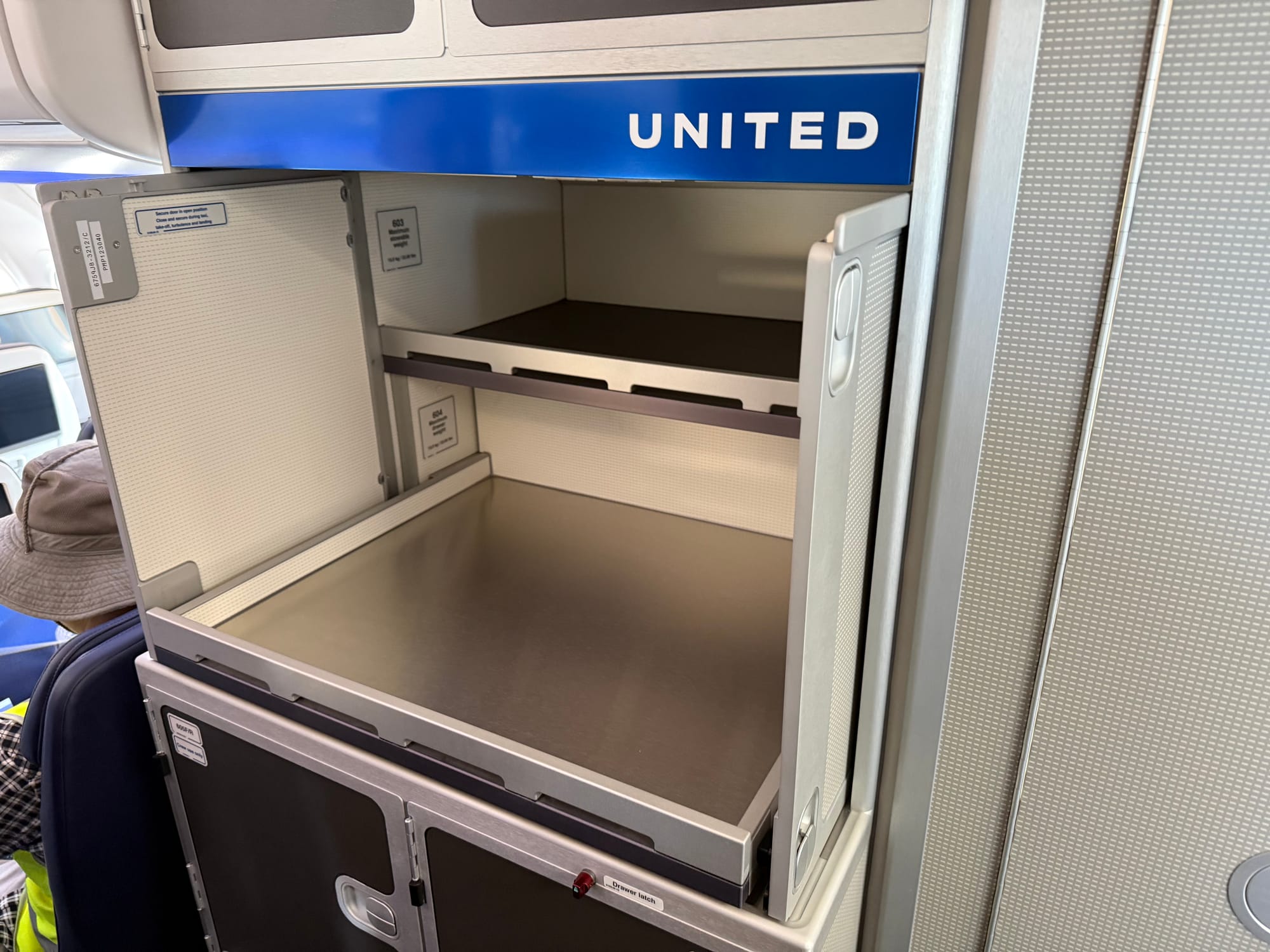
It will be notable to observe how the passenger and crew flow works through these spaces, especially during meal service and key busy periods when trolleys are out.
All in all: the whole aircraft would have been a lot more impressive several years ago
United is not alone in having some of its most recent business class products — this aircraft included — caught up in certification and production delays, meaning that they end up stuck for years in limbo. This means they feel less impressive when they launch halfway through the next cycle of seats.
Sure, this seat would have compared more favourably to everything else out there if it had launched in 2022 or 2023, although I think it’s fair to say that JetBlue’s 2021 Mint (based on Thompson’s Vantage Solo seat) looks and feels more upmarket and refined, even before looking at current aesthetics like Air Canada’s Glowing Hearted cabins.

The problem for United is that this seat is hitting the skies after its own next generation cabin, revealed for the 787-9 last year, and which we said then “excels in aesthetics”. That seat, also from Elevate, feels like it is such a massive step change in every way, resets expectations to the extent that this XLR seat now feels more dated and clunky than it might otherwise.
But I don’t think this is just a “colour, material and finish has moved on” issue. The F/LIST table is there, and it’s excellent. But also present are the various clunky shapes that join up in odd ways, with curves and angles that vary too much, and elements like the upside down remote that make it feel rushed, despite (or perhaps related to) the delays.
It’ll be fascinating to see how this seat looks and feels in its 737 implementation —presuming this is now a “when” rather than an “if” in FAA approval terms — and the extent to which another airline can refine this seat into something that doesn’t have all the caveats that this one does.
That’s happened before: the then-Sicma Cirrus herringbone seat launched by the then-US Airways in 2008–09 was refined by Cathay Pacific and JPA into the definitive seat of the 2010s. Will something similar happen with Elevate’s Altitude?
