Airports are an often-overlooked part of the airline passenger experience. Indeed, for shorthaul and even mid-haul flights, passengers may spend more time on the ground — getting to and from the airport, within the terminal, and after boarding — than they do in the air.
Designing these spaces within a wide variety of constraints is intricately fascinating, so The Up Front sat down with architect Ty Osbaugh, who leads the cities and airports work at design and architecture firm Gensler, for a wide-ranging discussion.
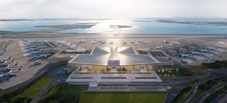
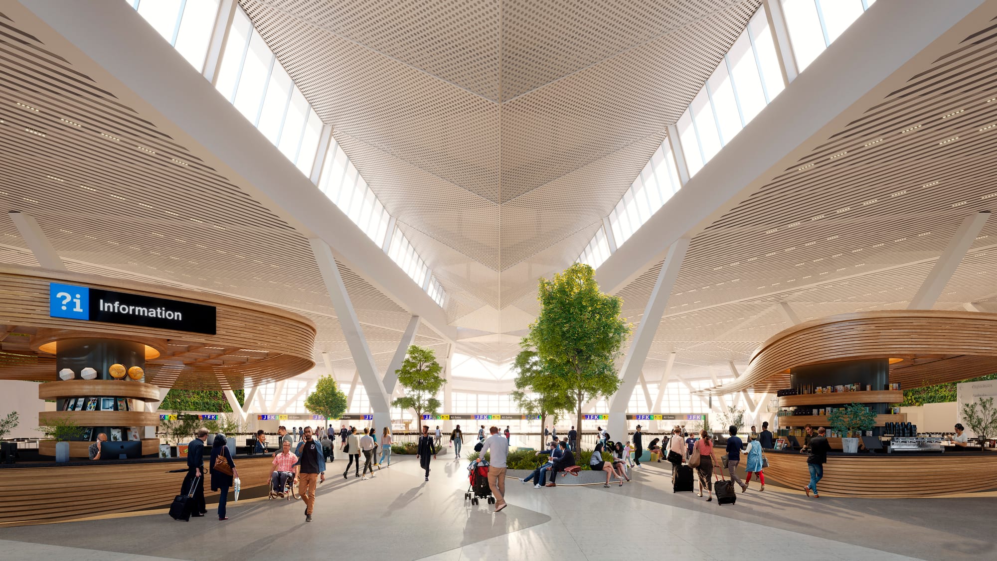
Gensler has designed terminals and airport experiences from San Francisco to Seoul Incheon, Auckland and Jackson Hole, and is currently working on the new terminal 1 at New York JFK, a $9.5 billion, 23-terminal-gate replacement for one of JFK’s most loathed terminals, the current 1998-era terminal 1.
Airport design worldwide has gone through generational changes, driven by factors including the size of airplanes, changing airline models, ground transportation, airport ownership, government priorities, carrier consolidation, new build airport vs existing facility, and much more.
As airports expanded with the jet age, the design and operational models varied, with a substantial amount of what we might in retrospect see as trial-and-error.
At one extreme would be New York JFK’s Terminal City concept, which had a central circulatory road with terminals mostly built and operated by individual airline: the Pan Am Worldport, the TWA Flight Center, the National Sundrome, plus a large consolidated international airline building. Some had multiple tenants — what would become the BOAC/British Airways-United terminal, for example — and most maxed out at a size of about two piers.
But as airlines contracted and expanded, the inflexibility of the terminal approach was laid clear. An airline growing in a city would be constrained unless it spilled over into a neighbouring terminal, while an airline reducing its presence in a city would have a major capital asset that was being underutilised.
During the same period, some airports were (and often remain) dominated by one carrier, leading to different design decisions. Think Paris Charles de Gaulle, Frankfurt, or London Heathrow, where the 1950s’ Europa and Britannic buildings (which became the now-demolished and replaced Terminal 2) and Oceanic building (now Terminal 3) were split by shorthaul/longhaul.
This split was later subdivided into British Airways and non-British Airways operations in the 1980s with the arrival of Terminal 4:
- Terminal 1: British Airways, mostly shorthaul
- Terminal 2: non-British Airways, mostly shorthaul
- Terminal 3: non-British Airways, mostly longhaul
- Terminal 4: British Airways, mostly longhaul
The construction of Terminal 5 in the 2000s moved most BA (and later Iberia) operations there, although even here there is not enough space for its operations, and there is enough overflow to Terminal 3 that BA still operates its own lounges in that terminal.
Terminal 4 is now mostly SkyTeam airlines (though not Delta and Virgin Atlantic), while Terminal 2 is mostly Star Alliance, and Terminal 3 everything from Emirates to Cathay to Virgin and Delta.
The fact that even all these attempts to explain Heathrow’s operational logic are incredibly oversimplified — Qatar, a oneworld airline with strong IAG affiliations, is in terminal 4, for example, while IAG subsidiary member Aer Lingus is in terminal 2 — is, perhaps, the greatest argument for fewer, larger terminals rather than more, smaller ones: flexibility.
Early airport design needed to respond quickly to fundamental changes in the size, shape and type of aircraft
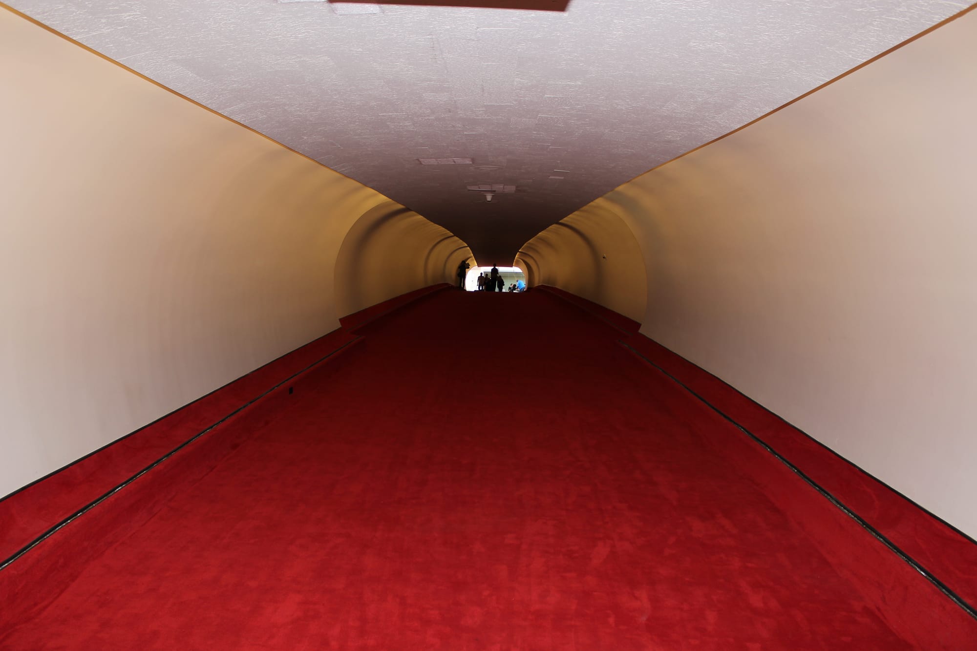
As early airports began to experience capacity constraints in the booming jet age, new out-of-town airports were designed from the mid-1960s. These often had revolutionary ideas about the design and shape of passenger terminals: Paris Roissy-Charles de Gaulle’s Terminal 1, designed by Paul Andreu in the shape of a brutalist concrete octopus, for example.
While delightful — it feels very space-age to bounce up and down the rubberised walkways inside the plastic tubes transporting you diagonally between the various levels of CDG T1 — these hit many of the same issues as Saarinen’s TWA terminal, in that the size and shape of aircraft changed.
An early solution was the “big box” model of Washington Dulles, where all airlines used a primary consolidated terminal, designed by Eero Saarinen in 1958. Indeed, this was a very early solution indeed, coming just two years after designing the TWA Flight Center for JFK in 1956.
Dulles also uniquely relied on “moon buggy” mobile lounges for many years, which transported passengers from the terminal to their remotely parked aircraft and back.
“When you look at kind of two terminals from a similar era of TWA and then Dulles,” Osbaugh says, “you see the evolution of an idea that TWA was a bespoke suit that was designed around a process that was really tightly defined: you must go here, then here, and then here. Then if one thing changes, i.e., the jet age — aircraft get bigger, they don't fit around the banjos anymore — now the whole system breaks down.”
The banjos Osbaugh refers to are the gate area structures at the TWA Flight Center, which extended from the main terminal via long corridors, and looked like long-necked banjos from above.
“Just three years later, starting to think about Dulles, the lesson learned is: let's provide a big box that then has loose fit items within it that can be changeable over time, and trying to really reinvent the paradigm,” Osbaugh explains. “To me, that's where, as a designer, we're much more in the Dulles mode: let's provide the framework. Let's provide a very elegant container for things and then everything that a human needs to feel, down at the human scale can be a kit of parts that's transferable and able to change over time.”
The evolution of that container model is what is now referred to as a “toastrack” terminal layout.
Toastracks: great for aircraft movements, not so much for transferring passengers
Toastrack terminals essentially consist of a main passenger service building, which may or may not have gates attached to it, that is then connected to a series of satellite gate areas, usually via an underground peoplemover. These are usually arranged in parallel with their terminal, and look like, well, an old-school toastrack.
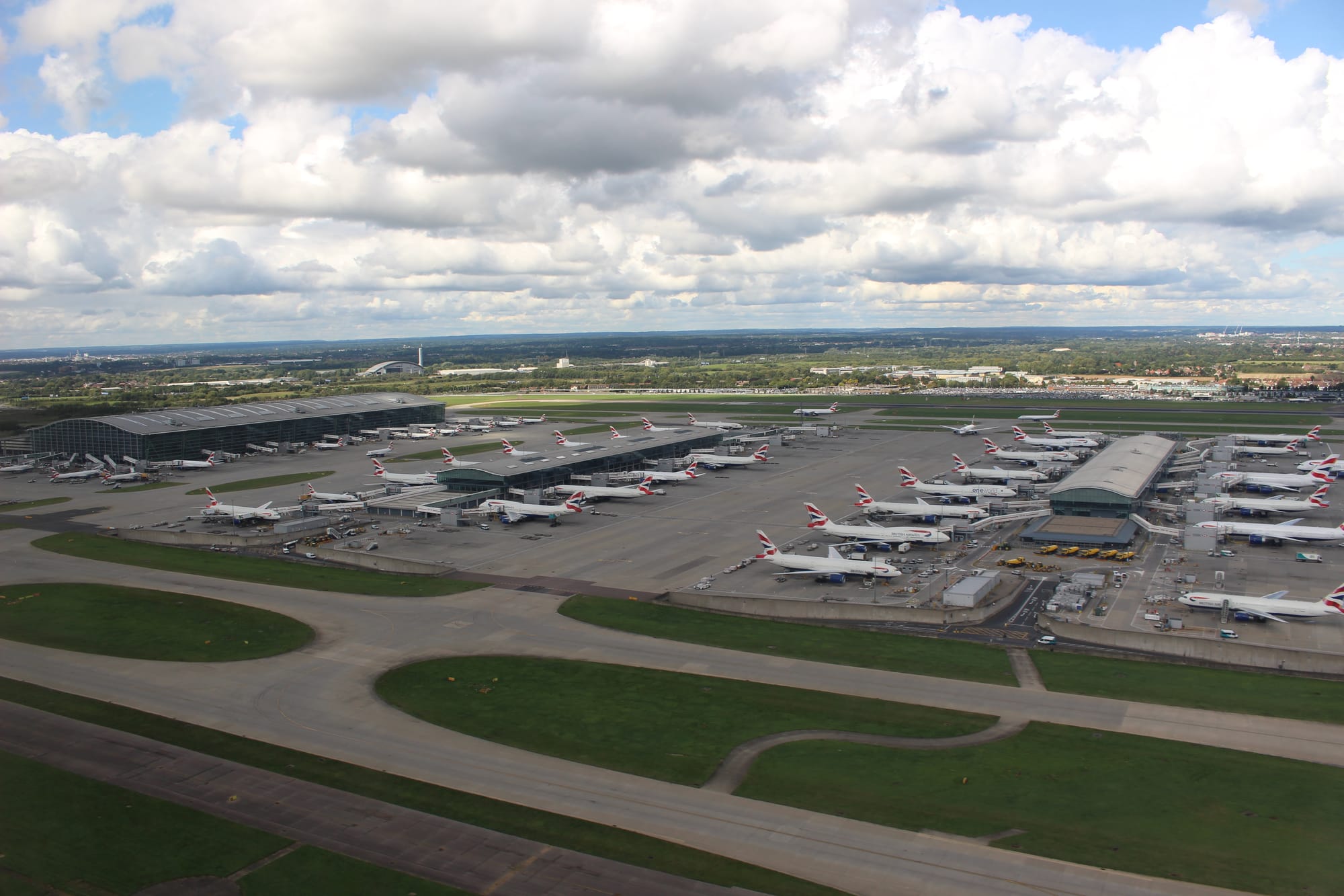
Washington Dulles eventually became a toastrack (with the construction of its satellite concourses and underground walkways), and it’s how Heathrow Terminal 5 was built (with its underground airside shuttle to the two satellite buildings), and how a generation of airports like Denver were designed in the 1990s and 2000s.
The benefits of the toastrack model include ground aircraft movement — airplanes can taxi in both directions, avoiding the cul de sac dead-ends of a U-shaped terminal — plus the ability to expand with relative ease by adding satellites.
“The toastrack idea, surprisingly, was driven a lot by airlines,” Gensler’s Ty Osbaugh says. “If I'm an airline, I'm moving aircraft, and moving them in straight lines that are inherently flexible is going to be better.”
Some toastrack terminals concentrate the majority of their airside passenger services like lounges, shops and restaurants in their main building. Heathrow Terminal 5 is a good example of this model, where the B and C satellite buildings offer only limited facilities.
Some, however, spread out their services across their satellites, such as Atlanta, where hometown airline Delta offers lounges in the main domestic terminal (concourse T), plus at least one lounge in each concourse A through E, and one in the international terminal (concourse F).
“I don’t knowhow Atlanta has figured out how to make it work,” Osbaugh says wryly. “That's not the textbook for how to do anything, but somehow they pull it off.”
Of course, Atlanta is a very connectivity-heavy airport (as opposed to an origin-or-destination-heavy one) and its connectivity is also unusual: “it's also a very, very domestic operation as well. It has an international component, but they do a really good job of separating out,” Osbaugh notes.
Indeed, Atlanta’s concourse F — located at the opposite side of the airport from concourse T, the main domestic terminal — also contains its international terminal. The toastrack satellites A through E are located between them in a row.
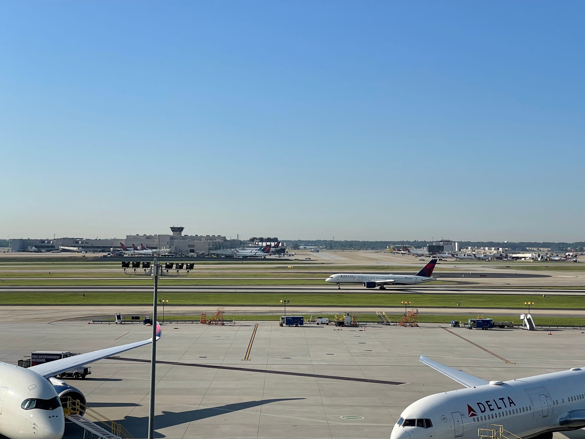
“However, what airlines are now telling us is that aircraft manoeuvrability is great until you need to connect passengers on quick connect times,” Osbaugh notes. “Essentially, [it's] that movement to get to a train, and the train just becomes another potential breakage point. I was in Denver yesterday and trying to rely on the train, and I had a two hour connection and almost missed it, and it's just because the train was down again.”
For the vast majority of terminals, the best way to transfer the greatest number of passengers at maximum efficiency is likely to be on foot, assisted by moving walkways. To make that work, designers turned to a new shape of airport terminal.
Starfish terminals — however they are shaped — are optimal for connecting passengers at hub airports
Enter the “starfish”. These terminals, shaped like an X, an H, or, well, a five-pointed starfish, comprise a passenger service building with multiple gate piers branching off from it, connected at the centre.
The benefits of the starfish model are primarily around internal transit passenger walking connectivity: passengers can walk from pier to pier for connections, rather than needing to take a train.
“At that point,” Osbaugh says, “the passenger can control their journey [and] now has retail opportunities, both on the way to the gate and at different parts along the journey. So I do think it's become more of a connecting time issue that's now being prioritised over an airline or aircraft movement issue.”
Examples of modern starfish include Beijing Daxing (a five-pier starfish), Abu Dhabi Terminal A (a four-pointed X) and Western Sydney (ultimately to be a four-pointed H).
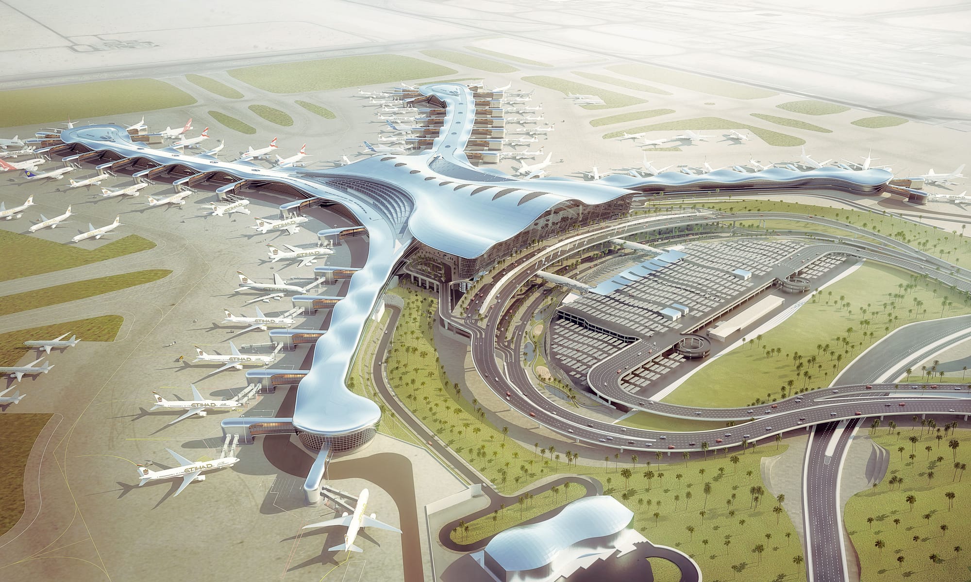
Inherently, combinations of these types of terminals exist: Beijing Capital’s Terminal 3 is in the shape of an I with two slices taken out of the vertical line: two satellite terminals plus four piers that resemble the X style. Abu Dhabi Terminal A, an X-shaped starfish, is planned to also have a satellite terminal as it grows.
“From our research, an H or an X becomes viable once you hit about 40 million passengers,” Osbaugh explains. “Once you decide that you're going to be a 50 million passenger facility, then you've got to look outside of that, otherwise the you lose the value of the shape. now you're into crazy walking distances, and you might as well put in an automated system.”
That is, of course, a per-terminal annual number, not per-airport. But how many airports might fall into that category?
Airport trade group ACI’s 2024 passenger numbers, just released, show the top five airports by passengers are:
- 108 million, Atlanta, ATL
- 92 million, Dubai, DXB
- 88 million, Dallas/Fort Worth, DFW
- 86 million, Tokyo Haneda, HND
- 83 million, London Heathrow, LHR
These numbers descend through airport number 20 on the list, Bangkok (Suvarnabhumi, BKK), with 62 million passengers, and with growing travel demand across much of the world — and the hub model remaining strong — it seems likely that more larger terminals will be required.
“One of the big trends we're seeing is a push toward what I call mega-terminals,” Osbaugh says. “The days, I think, of doing an airline specific mid-size terminal, are really challenging.”
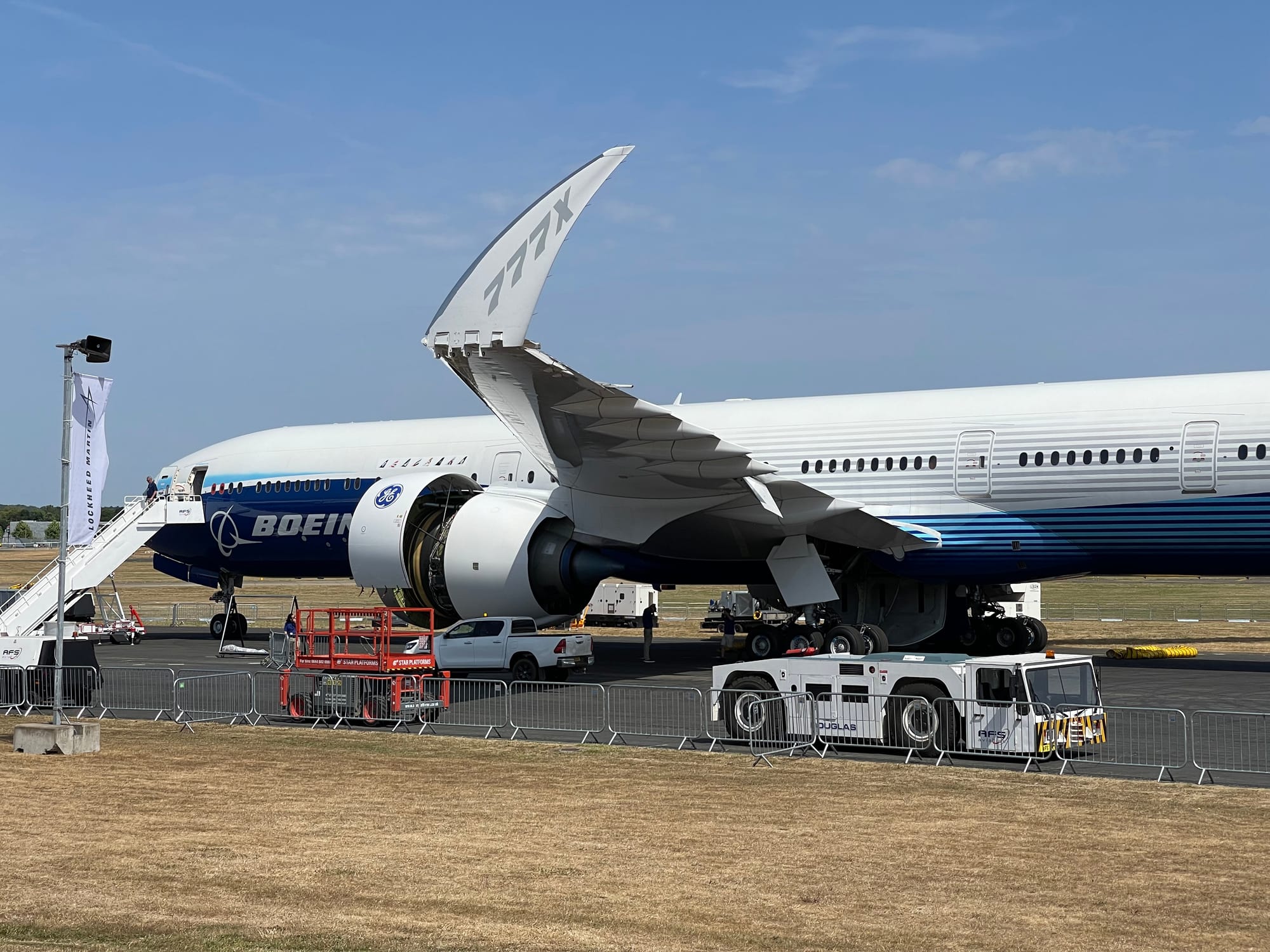
That size demand will also rise with larger aircraft. In the 2000s, many airports and terminals struggled to update their infrastructure to account for the Airbus A380, while Boeing’s 777X’s folding wingtips are a highly technical way to minimise infrastructure impact.
But looking to the future, it seems likely that aircraft wingspan will be increasing, whether with adaptive wings along the lines of Airbus’ AlbatrossONE winged tube concept or with blended wing body aircraft like JetZero’s. Airports and terminals need to adapt now.
“Looking at Terminal One, we didn't necessarily use a an aircraft size of today as our design aircraft model,” Osbaugh explains. “When we did all the MARS [Multiple Aircraft Ramp System] gating on it, we we added 20 feet in both dimensions, wingtip and nose to tail, to be able to anticipate and give ourselves a little bit of breathing room for what might happen in the future.”
Yet this futureproofing is often disincentivised by the corporate structures and incentives of airport operators and, in some cases, privatised or public-private-partnership terminals, governments, and other stakeholders. This can create short-term thinking that creates problems down the road.
“I think you just have to have to take a little bit of a risk, I guess, as to what your terminal is going to be, and what is the true lifespan,” Osbaugh says. “Terminal One is interesting in that, because it's privatised, the developers want to take no decision beyond a day of of their leasehold, so they're rolling the dice on the 40 year thing — and then [when] you're 40 and a day, it becomes someone else's problem.”
Other drivers beyond the purely financial often come into play as well. Cities, states, regions and countries will have varying degrees of influence and control, from full ownership to urban planning, and their priorities will differ.
The priorities at New York JFK, say, will differ from a city-state or geographically small country with a national carrier that the government wants to be a leading global airline, and where that government is willing to fund both airline and airport as public diplomacy efforts rather than requiring them to be strictly market-driven commercial concerns.
Many of the most wow-factor airports fall into the latter category, but even where money is indeed an object, smart design can have an outsized impact.
Airport design, identity and aesthetics don’t have to be cookie-cutter — or pastiche
There’s a fascinating tension in airport design between creating a sense of individual place on the one hand and ensuring that the airport experience is easily navigable and familiar for a maximum of passengers on the other.
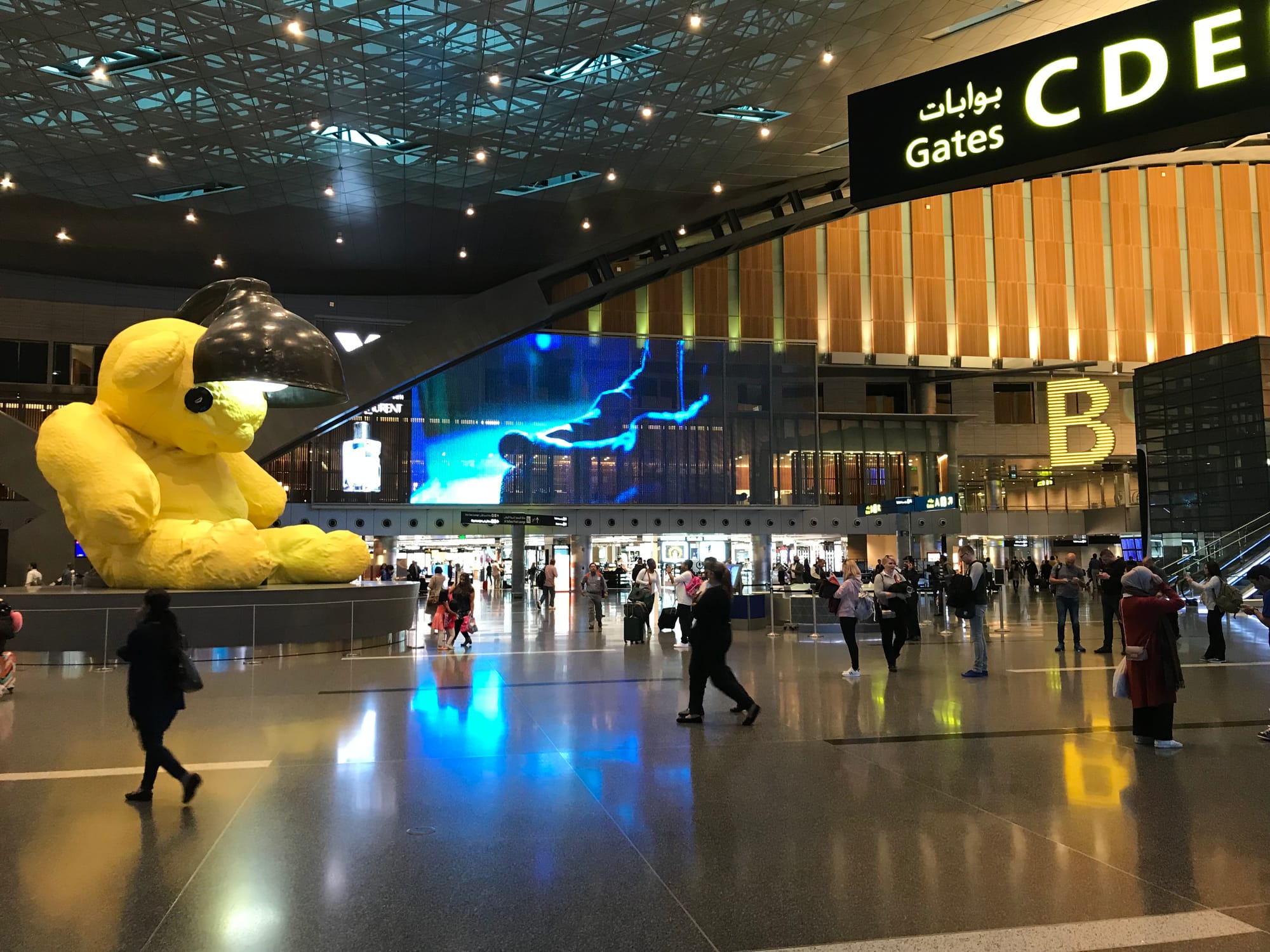
“Every terminal that we do in North America, when we compete for it, the first thing they ask for is give us a sense of place, which is probably the worst thing you could ask for. Inevitably, you get a Disney view on what the city is,” Osbaugh says. “As a designer, you've got to distill it down, and it can't be putting a teddy bear in — it's got to be something that's much more speaking to the culture.”
In many ways, summing up the essence of a smaller city is a relatively simpler task.
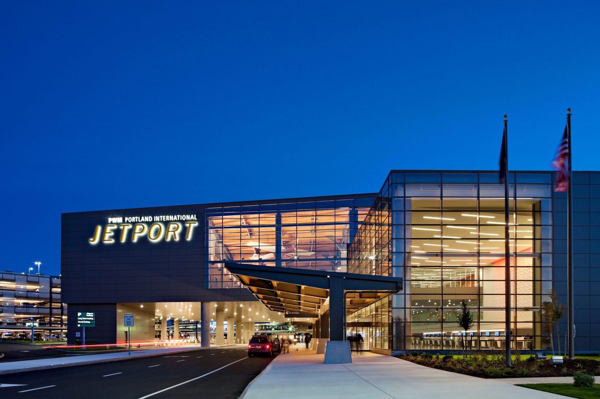
“Years ago, we had done a terminal in Portland, Maine, and the whole design was based on shipbuilding and that culture,” Osbaugh explains. “To me, what was really successful is they had a food program — because it's right on the bay — where they were actually bringing in fresh lobster from the bay every morning. Off to one side, because we had a flat roof on the terminal, we actually built an herb garden. So the restaurants were all pulling together from fish coming in daily, directly to the airport, and other ingredients that were hyper local that you could use.”
This becomes a much more complicated ask as the size of city grows. What is the essence of London, of Beijing, of Delhi, of Buenos Aires?
“The struggle then becomes,” Osbaugh says, “when we're designing JFK and the Port Authority [the airport operator] is saying it's got to be all about a New York experience. Well, I've lived in New York, I can tell you what my experience was. And it's gritty, it's rough, it's kind of in your face. So we do a design that looks like that, and then the Port Authority says, 'but it's got to be five star’.”
Aviation has a long history of taking inspiration from other elements of the hospitality and entertainment industry, and here Osbaugh looks to the modern stadium experience during sports and concerts.
Stadiums, he says, “get branding much better than airports do, and they're branding themselves that stadiums are the containers of memory. When I go to a stadium or I go to a concert, there's something that I always remember about that day. My best airport days are when I remember nothing about going through them. How do you reverse that and make it so that an airport journey can be memorable and it's going to have a little bit of something that was unexpected in it?”
There are clear links here, and not just because airlines already have naming rights for stadiums and arenas like London’s Emirates Stadium (Arsenal football club) and Dallas’ American Airlines Center (the Stars hockey and Mavericks basketball teams).
There and elsewhere, airlines wanting to boost their premium market perception operate lounges and VIP areas. Brooklyn’s Barclays Center, for example, has lounge spaces branded for both Qatar Airways and jetBlue. How can airports and airlines interpret these spaces within the airport experience?
At the same time, what can airlines and airports learn from other contexts within the world of travel? Looking to the increasingly popular cruise market, a key trend over the last few years has been the growth of premium experiences on mass-market lines such as Norwegian Cruise Line’s The Haven or MSC Cruises’ Yacht Club.
These “ship-within-a-ship” experiences go beyond the previous model where suite passengers might have access to a fancier restaurant or a special set of sun loungers, with entire sections of the ship near the premium rooms and suites closed off to provide premium lounges, sun decks, and pool areas, service from special butlers, fast-track elevators, priority shore transfers, and even featuring premium areas on the lines’ private islands in the Caribbean.
More so than premium drop-off and check-in areas (like the dropoff, checkin and priority security of the Virgin Atlantic Upper Class Wing at Heathrow terminal 3, or the vertical separation of Emirates’ business and first class lounge floor at Dubai terminal 3, the ship-within-a-ship concept extends the premium experience much further throughout the passenger journey.
As the premium market grows, and as business and first class passengers’ expectations are set by experiences like these, airlines and airports will need to design experiences to match.
This free-to-read article is made possible by supporters of The Up Front. Unlock all our feature articles as a Subscriber, and gain even more critical industry intelligence as a Pro member.